> ## Documentation Index
> Fetch the complete documentation index at: https://docs.usedatabrain.com/llms.txt
> Use this file to discover all available pages before exploring further.
# Adding Elements to Dashboard
> This guide provides a straightforward approach to enhancing your dashboard by adding new elements, which can improve data visualization and user engagement.
### 1. Access Elements Creation
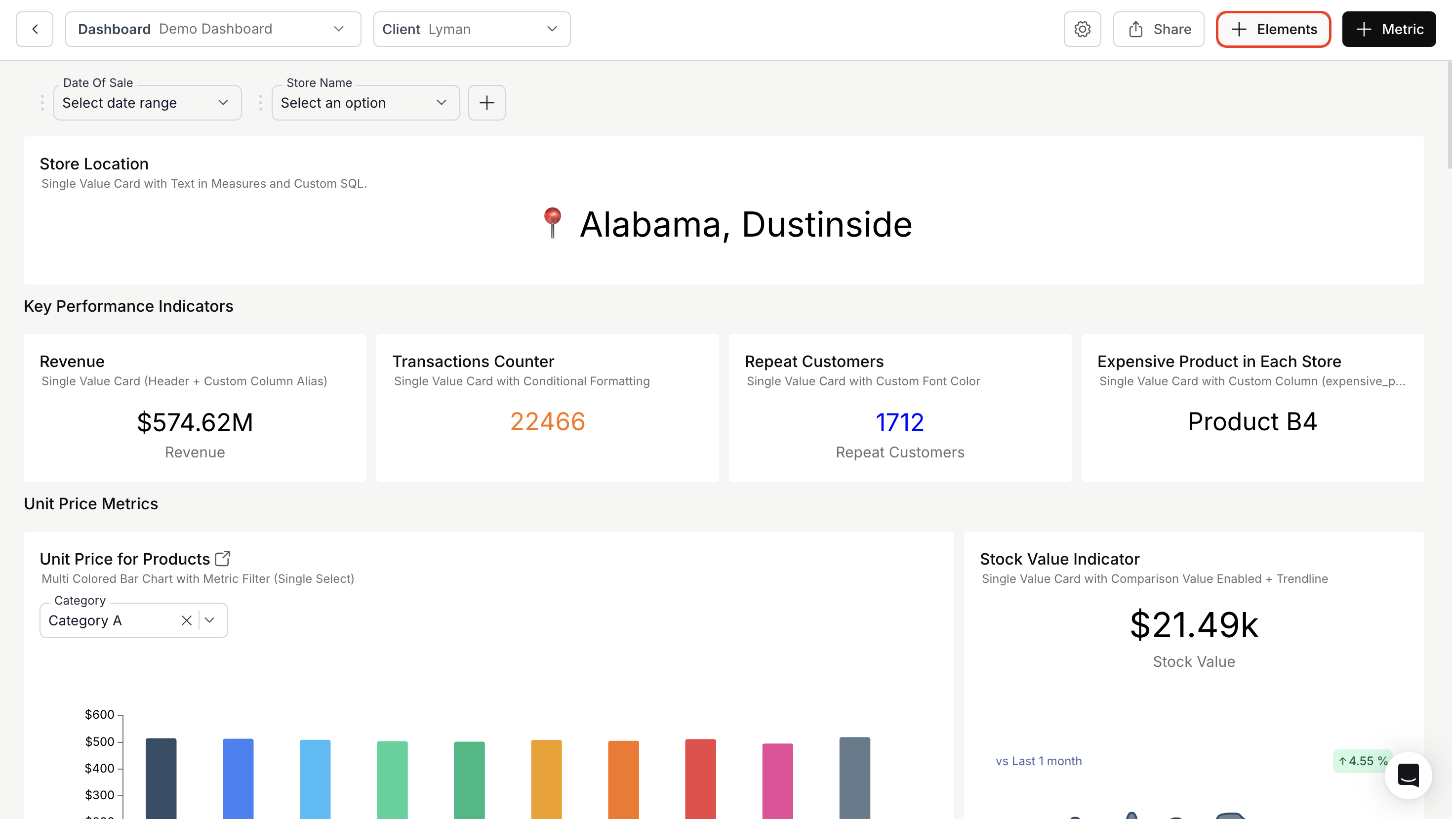
Click the **"+ Elements"** button in the top-right corner of the dashboard (next to the preview icon).
 ### 2. Add Elements Section
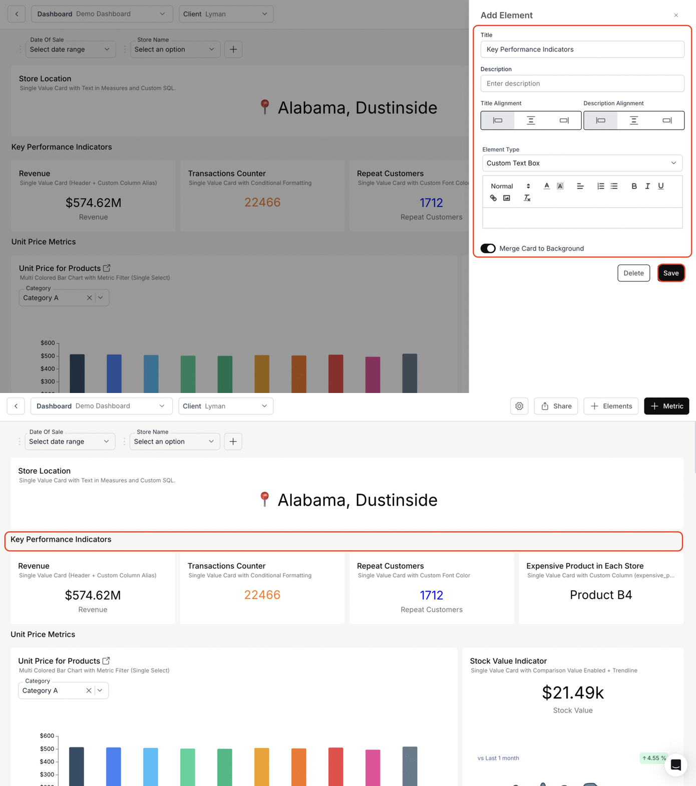
* Enter a title and description.
* Set title and description alignment (left, center, or right).
* Choose from the following element types:
* `Custom Text Box`
* `Metric Summary`
* `Metric Expression`
#### Custom Text Box:
* Enter the content in the text box and format using the toolbar.
* Optionally, toggle **"Merge Card to Background"** if you want the element to blend with the dashboard background.
* Click **"Save"** to add the element to the dashboard.
### 2. Add Elements Section
* Enter a title and description.
* Set title and description alignment (left, center, or right).
* Choose from the following element types:
* `Custom Text Box`
* `Metric Summary`
* `Metric Expression`
#### Custom Text Box:
* Enter the content in the text box and format using the toolbar.
* Optionally, toggle **"Merge Card to Background"** if you want the element to blend with the dashboard background.
* Click **"Save"** to add the element to the dashboard.
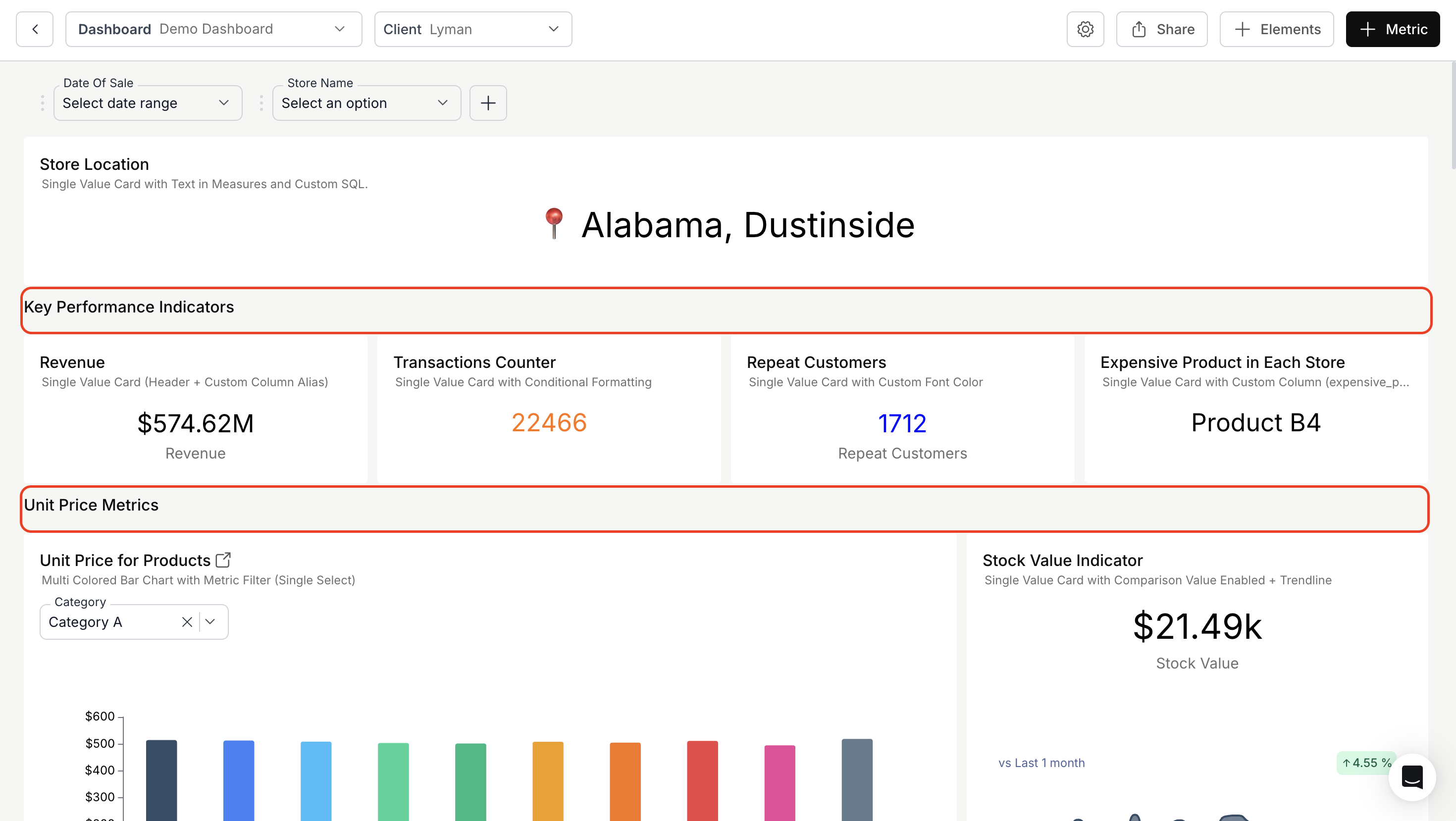
 > Custom Text Box Elements can be used as section separators to group relevant metrics under distinct categories. They allow intuitive, categorized data presentation.
By using `Custom Text Box` elements as section headers, you can group and label these sections, making it easier for users to locate specific data types and enhancing the dashboard’s overall readability.
> Custom Text Box Elements can be used as section separators to group relevant metrics under distinct categories. They allow intuitive, categorized data presentation.
By using `Custom Text Box` elements as section headers, you can group and label these sections, making it easier for users to locate specific data types and enhancing the dashboard’s overall readability.
 ### Metric Summary:
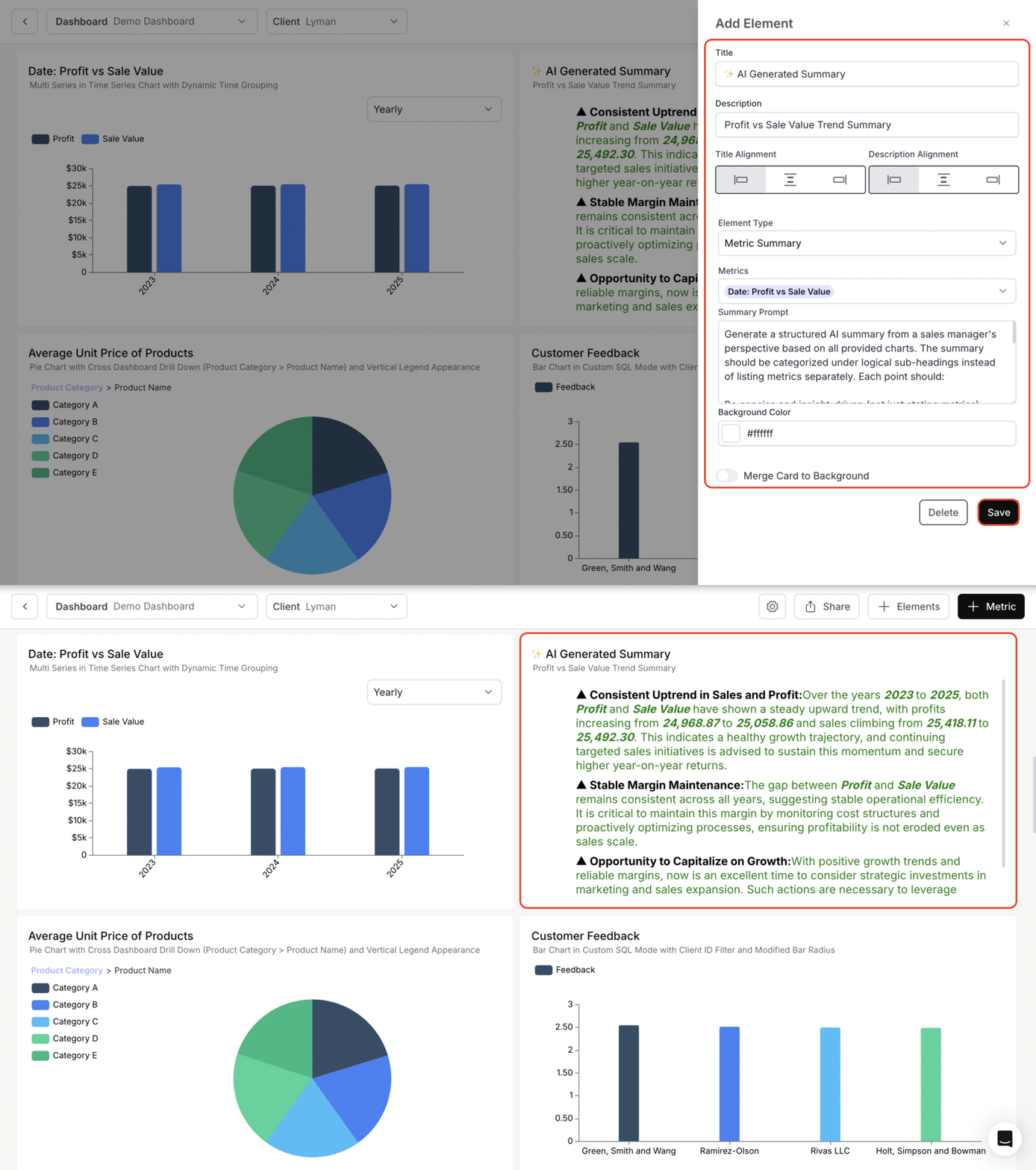
* Select the metrics to include and enter a prompt for the summary.
* Optionally, toggle **"Merge Card to Background"** if you want the element to blend with the background.
* Click **"Save"** to add the element to the dashboard.
### Metric Summary:
* Select the metrics to include and enter a prompt for the summary.
* Optionally, toggle **"Merge Card to Background"** if you want the element to blend with the background.
* Click **"Save"** to add the element to the dashboard.
 Learn more about how to configure Metric Summary and its use cases in Databrain.
### Metric Expression:
* Select the metrics you want to include in the **"Metric Expression"** textbox.
* Use metric IDs to perform calculations and define expressions.
* Optionally, toggle **"Merge Card to Background"** if you want the element to blend with the background.
* Click **"Save"** to add the element to the dashboard.
Learn more about how to configure Metric Summary and its use cases in Databrain.
### Metric Expression:
* Select the metrics you want to include in the **"Metric Expression"** textbox.
* Use metric IDs to perform calculations and define expressions.
* Optionally, toggle **"Merge Card to Background"** if you want the element to blend with the background.
* Click **"Save"** to add the element to the dashboard.
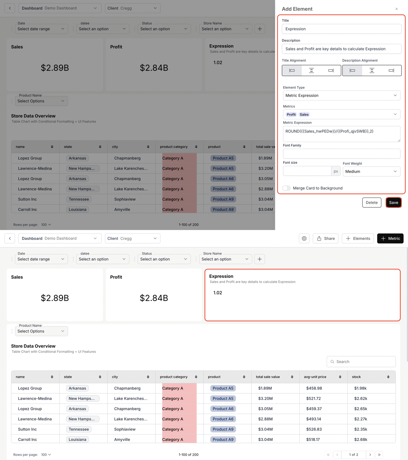 For more details on Metric Expression, kindly refer the below link.
You’ve successfully added elements to your dashboard.\
Your dashboard now includes enhanced summaries, expressions, and formatted text sections that improve readability, structure, and user engagement.
For more details on Metric Expression, kindly refer the below link.
You’ve successfully added elements to your dashboard.\
Your dashboard now includes enhanced summaries, expressions, and formatted text sections that improve readability, structure, and user engagement.