> ## Documentation Index
> Fetch the complete documentation index at: https://docs.usedatabrain.com/llms.txt
> Use this file to discover all available pages before exploring further.
# Chart Actions
> Enhance your data visualization and analysis with these powerful chart customization features.
Unlock the full potential of your data visualizations with Databrain's powerful chart actions. From interactive click behaviors and intelligent drill-downs to advanced forecasting and security controls, these features transform static charts into dynamic analytical tools. This guide walks you through essential chart actions that will help you create more engaging, interactive, and secure data experiences.
1. **Access Chart Actions**:
* Navigate to your metric card.
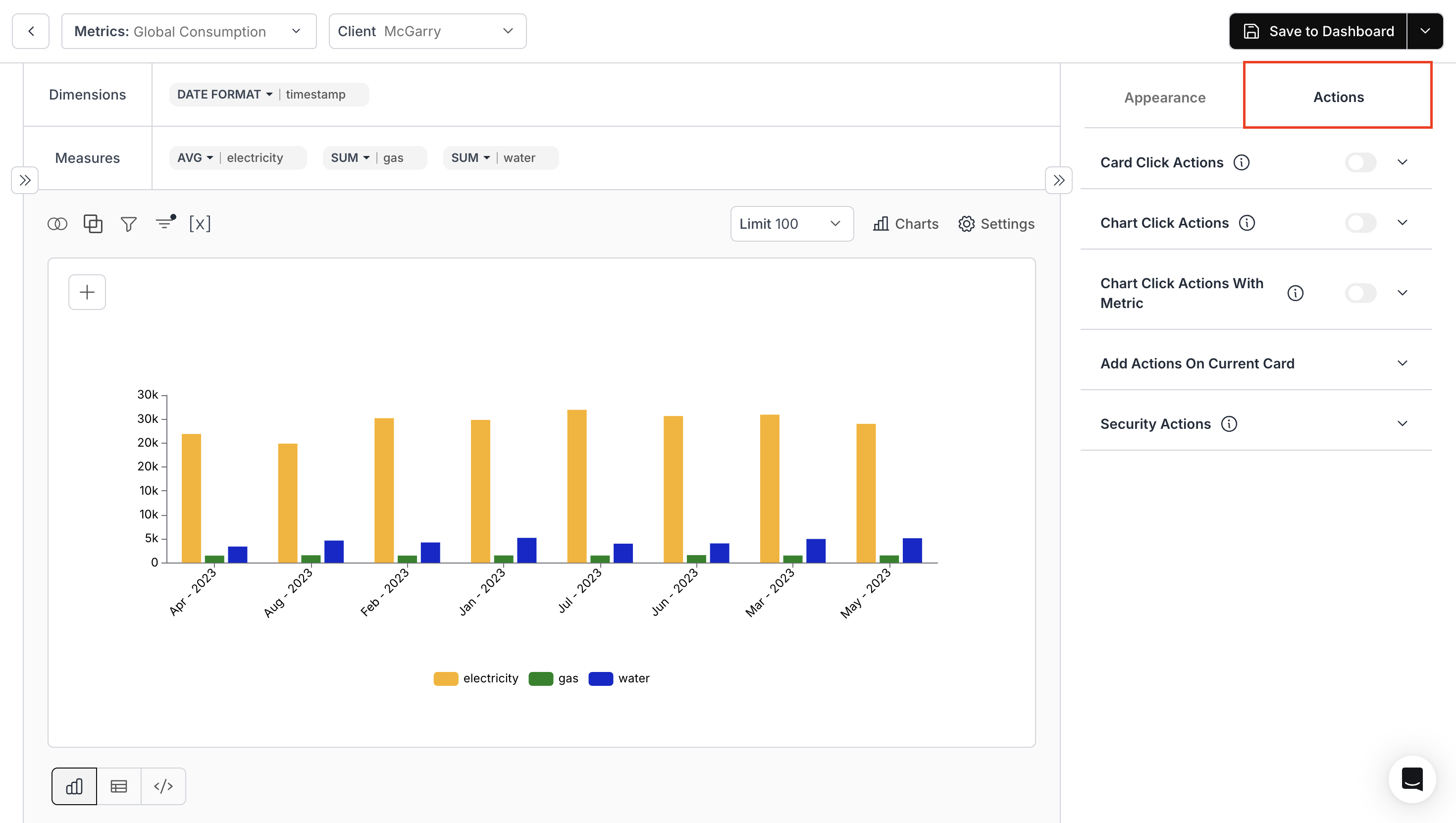
* Click on the **“Settings”** icon in the top-right corner of the chart area.
* Head to the **“Actions”** tab to begin customizing.
 2. **Card Click Actions**:
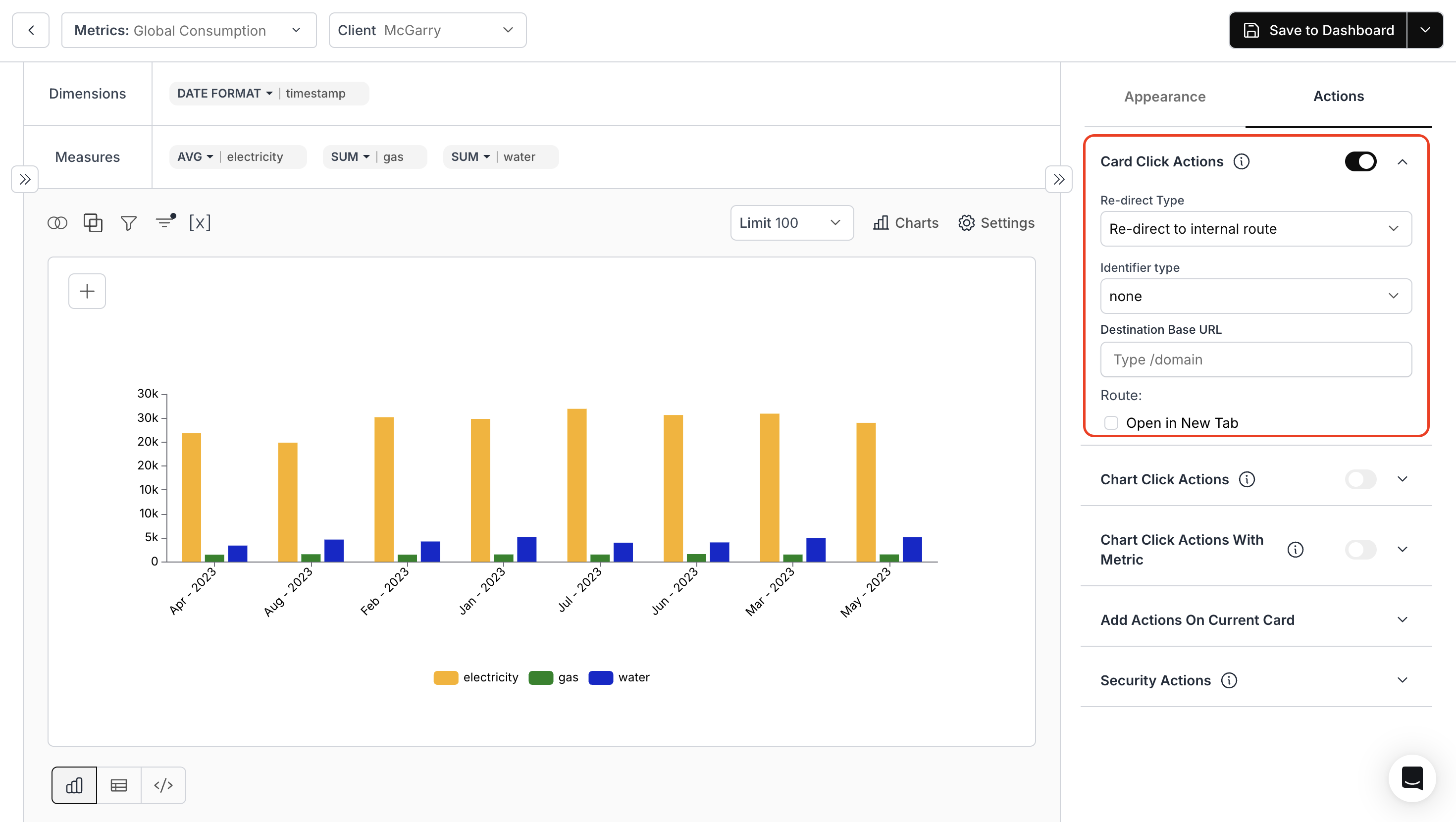
* Click on the card in your dashboard to redirect to a specific page. Toggle to activate or deactivate.
* **Redirect Type**: Define the type of redirection.
* **Identifier Type**: Choose the identifier for redirection.
* **Destination Base URL**: Specify the URL to direct users.
2. **Card Click Actions**:
* Click on the card in your dashboard to redirect to a specific page. Toggle to activate or deactivate.
* **Redirect Type**: Define the type of redirection.
* **Identifier Type**: Choose the identifier for redirection.
* **Destination Base URL**: Specify the URL to direct users.
 For more details, kindly refer the below link
This card links to the full documentation on configuring card click actions in your dashboard.
### 3. **Chart Click Actions**
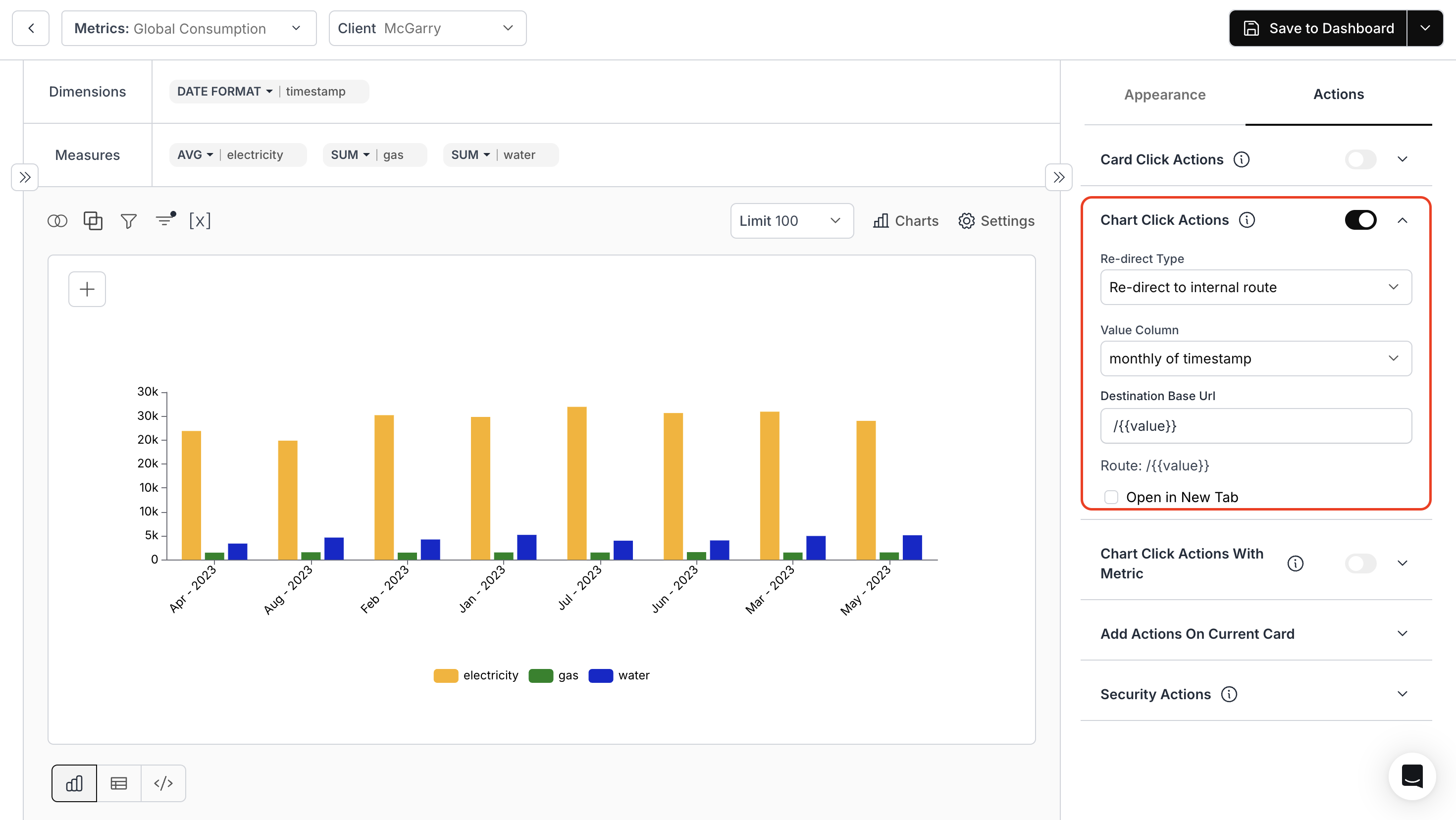
* Enable the toggle to set up actions when you click on the chart.
* **Redirect Type**: Choose how you want to redirect.
* **Value Column**: Select the data column for redirection.
* **Destination Base URL**: Enter the URL for redirection.
For more details, kindly refer the below link
This card links to the full documentation on configuring card click actions in your dashboard.
### 3. **Chart Click Actions**
* Enable the toggle to set up actions when you click on the chart.
* **Redirect Type**: Choose how you want to redirect.
* **Value Column**: Select the data column for redirection.
* **Destination Base URL**: Enter the URL for redirection.
 For more details, kindly refer to the link below:
Learn how to configure redirection logic when clicking on chart elements including internal route types, value column mapping, and dynamic URL targets.
### 3. **Chart Click Actions with Metric**
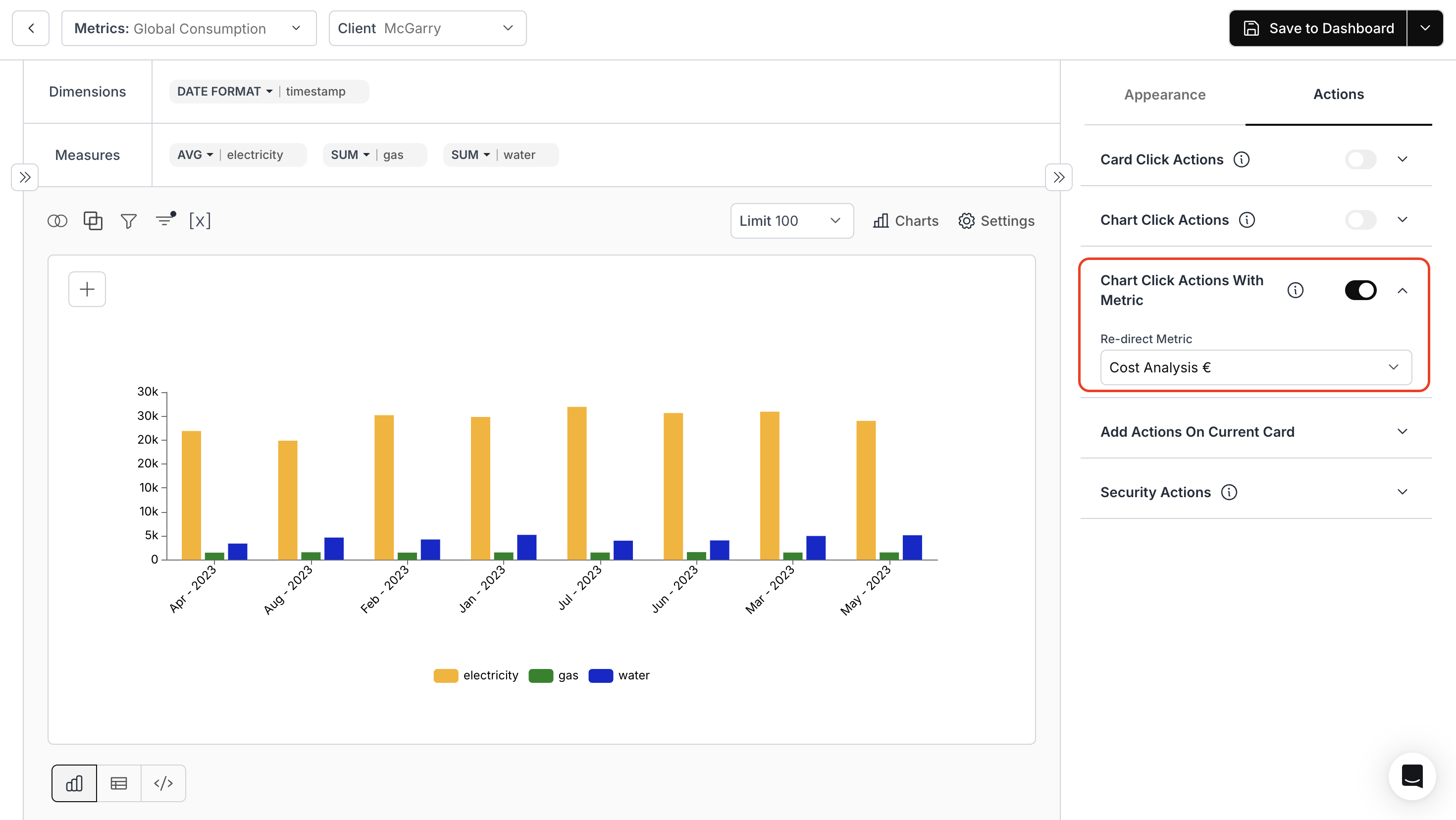
* Specify the Metric name to which Chart should be redirected.
For more details, kindly refer to the link below:
Learn how to configure redirection logic when clicking on chart elements including internal route types, value column mapping, and dynamic URL targets.
### 3. **Chart Click Actions with Metric**
* Specify the Metric name to which Chart should be redirected.
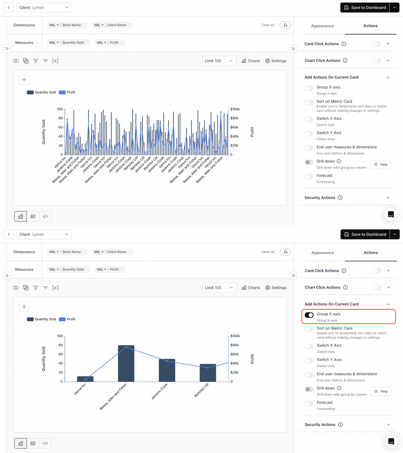
 ### 4. **Group X-Axis**
Enable grouping to group your data along the x-axis to streamline visualization.
#### Use Case:
Let us take a combo chart with dual scales showing quantity sold (purple bars) and profit (blue line) by store name and client name.
When you toggle on **Group X-Axis**:
* The detailed view automatically consolidates into four main store name groups
* Both quantity sold and profit values are aggregated within each group
* The result is a clearer visualization showing consolidated performance by store
### 4. **Group X-Axis**
Enable grouping to group your data along the x-axis to streamline visualization.
#### Use Case:
Let us take a combo chart with dual scales showing quantity sold (purple bars) and profit (blue line) by store name and client name.
When you toggle on **Group X-Axis**:
* The detailed view automatically consolidates into four main store name groups
* Both quantity sold and profit values are aggregated within each group
* The result is a clearer visualization showing consolidated performance by store
 ### 5. **Sort on Metric Card**
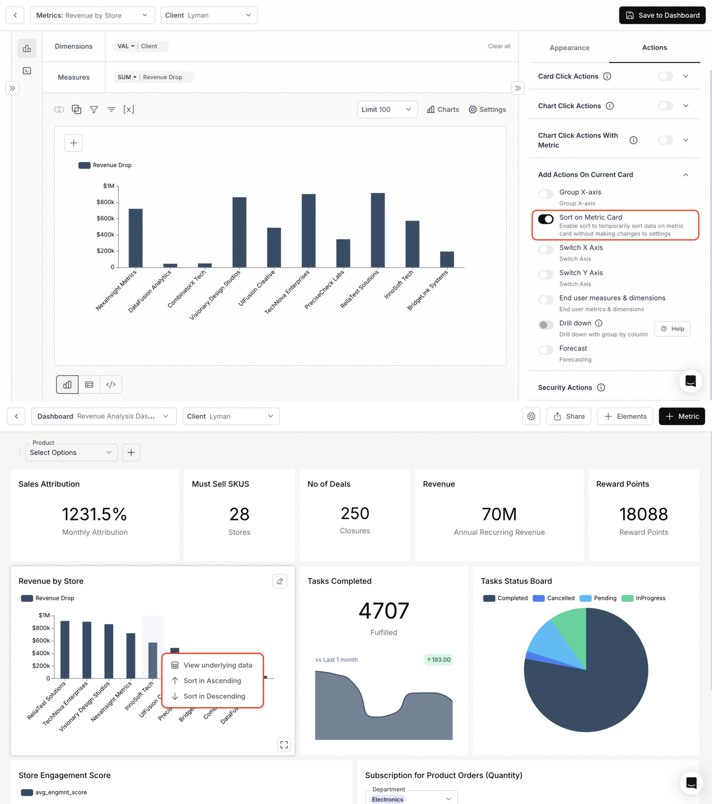
Sort the data directly on the metric card for better insights.
* Turn on the **Sort on Metric Card** Toggle and save the metric to Dashboard.
* Right Click on the chart to sort the data in either ascending or descending order.
### 5. **Sort on Metric Card**
Sort the data directly on the metric card for better insights.
* Turn on the **Sort on Metric Card** Toggle and save the metric to Dashboard.
* Right Click on the chart to sort the data in either ascending or descending order.
 ### 6. **Switch X axis, Switch Y axis**
You can add Metric Filters for each card just like "Dashboard Filters". For an in-depth guide on adding metric filters, refer to the below link.
Learn how to toggle between axis dimensions to change your chart's view dynamically.
### 7. **End user measures & dimensions**
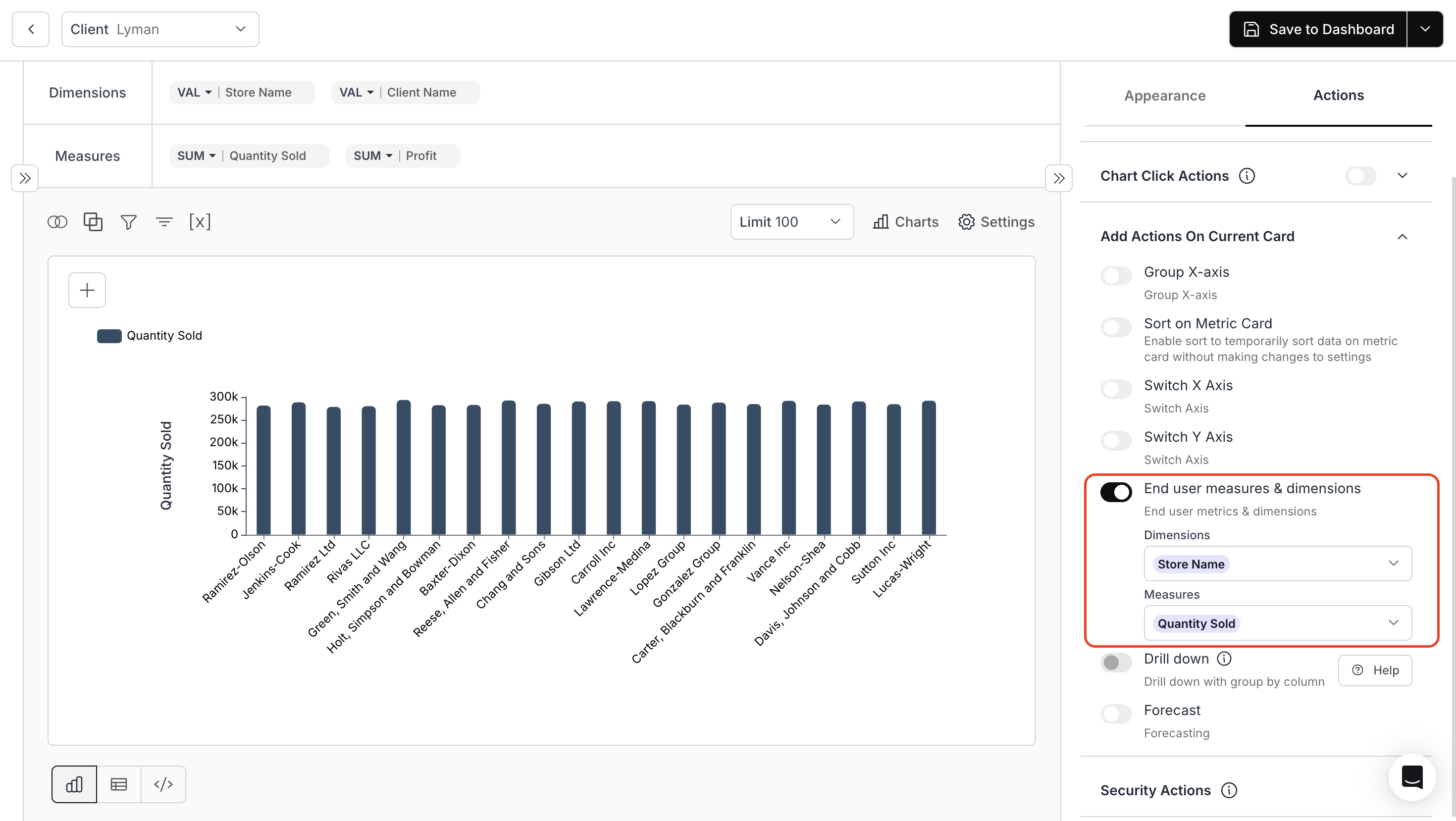
To configure dimensions and measures for charts and adjust them as needed, enhancing interactive data exploration capabilities.
**Use Case:**
Let us take a line chart with multiple metrics – quantity sold, unit price, and profit across stores.
When you toggle ON **"End user measures & dimensions"** and select:
* **Dimension**: store name
* **Measure**: quantity sold
The chart immediately simplifies to show only quantity sold across stores, making it easier to analyze this specific metric.
### 6. **Switch X axis, Switch Y axis**
You can add Metric Filters for each card just like "Dashboard Filters". For an in-depth guide on adding metric filters, refer to the below link.
Learn how to toggle between axis dimensions to change your chart's view dynamically.
### 7. **End user measures & dimensions**
To configure dimensions and measures for charts and adjust them as needed, enhancing interactive data exploration capabilities.
**Use Case:**
Let us take a line chart with multiple metrics – quantity sold, unit price, and profit across stores.
When you toggle ON **"End user measures & dimensions"** and select:
* **Dimension**: store name
* **Measure**: quantity sold
The chart immediately simplifies to show only quantity sold across stores, making it easier to analyze this specific metric.
 ### 8. **Drill Down**
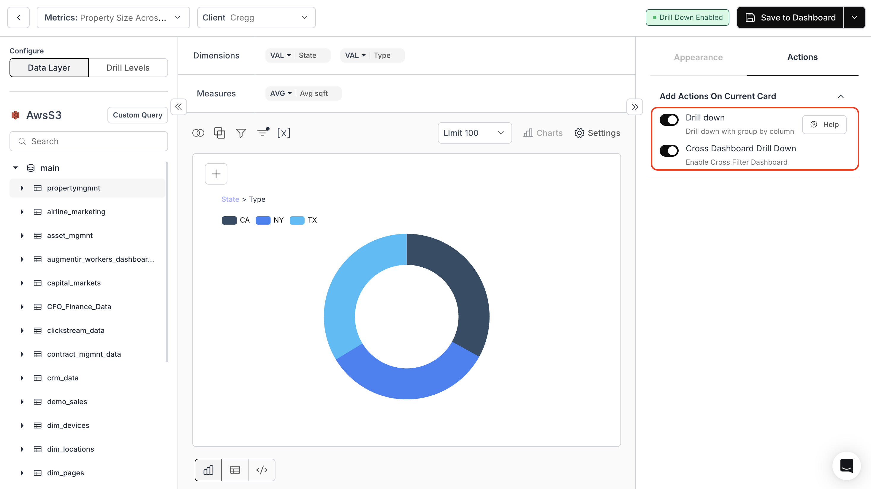
* For charts with multiple dimensions, toggle the **Drill down** option.
* **Cross Dashboard Drill-down**: Adjust the entire dashboard based on your selected dimensions.
### 8. **Drill Down**
* For charts with multiple dimensions, toggle the **Drill down** option.
* **Cross Dashboard Drill-down**: Adjust the entire dashboard based on your selected dimensions.
 For more details, kindly refer the below links:
Learn how to enable and use drill-down functionality on metric cards.
Configure and apply cross-filters across dashboards using drill-down context.
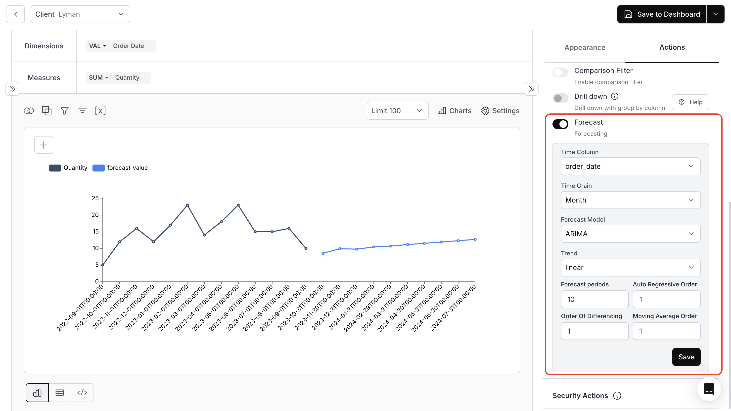
### 9. **Forecasting**
Enable or disable forecasting to predict future trends.
**Use Case:**\
Let us take a line chart showing quantity over time (2022–2024). When you toggle ON **"Forecast"** and configure:
* **Time Grain**: Choose the relevant time intervals
* **ARIMA Model Options**: Choose from linear, constant, or constant + linear
* **Prophet Model Options**: Select linear or flat trends
* **Adjust Hyperparameters**: Fine-tune your forecasting models
For more details, kindly refer the below links:
Learn how to enable and use drill-down functionality on metric cards.
Configure and apply cross-filters across dashboards using drill-down context.
### 9. **Forecasting**
Enable or disable forecasting to predict future trends.
**Use Case:**\
Let us take a line chart showing quantity over time (2022–2024). When you toggle ON **"Forecast"** and configure:
* **Time Grain**: Choose the relevant time intervals
* **ARIMA Model Options**: Choose from linear, constant, or constant + linear
* **Prophet Model Options**: Select linear or flat trends
* **Adjust Hyperparameters**: Fine-tune your forecasting models
 ### 10. **Hide Coloumns Using Custom Underlying Data Dropdown or Security Actions Dropdown**
* **Hide Columns by SQL Query**: Write the corresponding SQL query to hide required columns from Underlying Data.
### 10. **Hide Coloumns Using Custom Underlying Data Dropdown or Security Actions Dropdown**
* **Hide Columns by SQL Query**: Write the corresponding SQL query to hide required columns from Underlying Data.
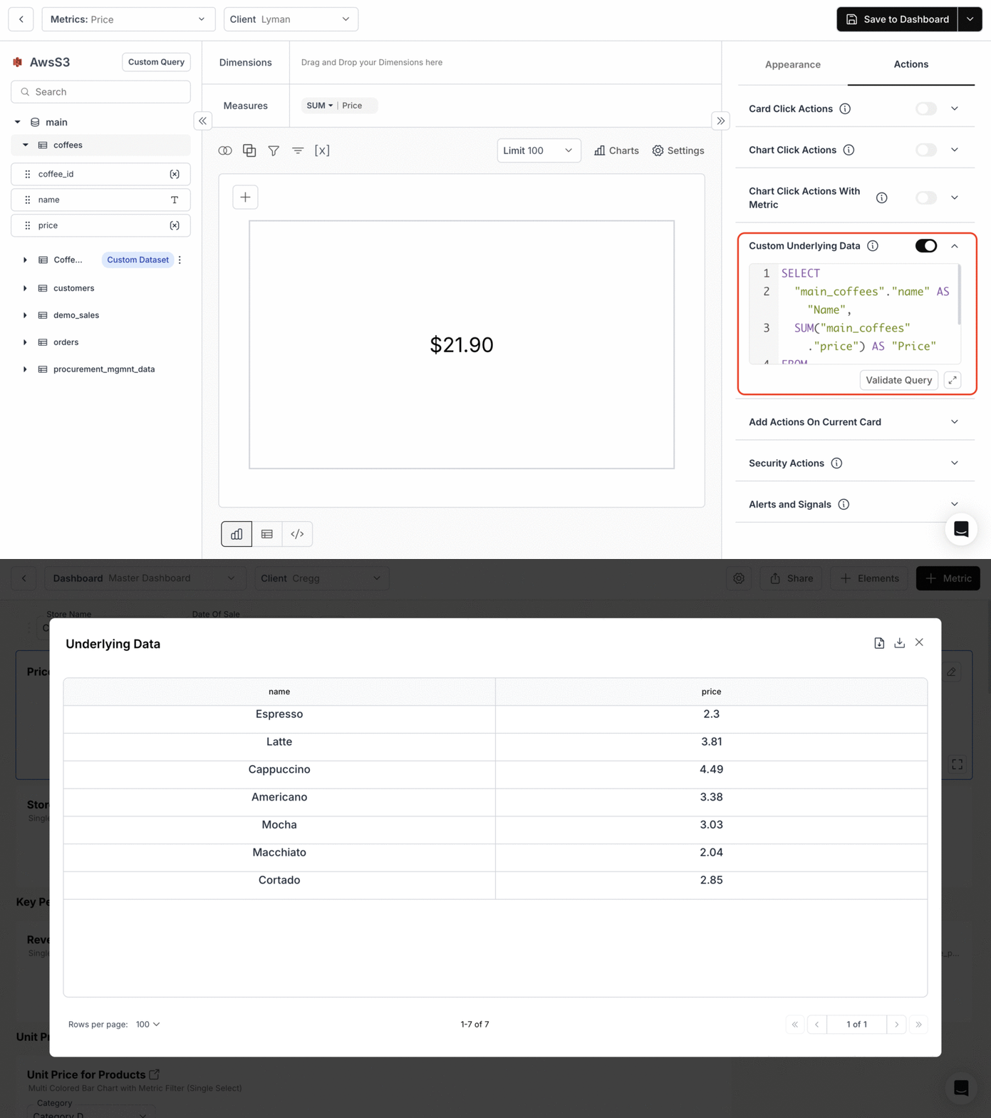 * **Hide Columns**: Conceal specific columns from view.
* **Hide Columns from CSV data**: Prevent certain columns from being included in CSV exports.
* **Hide Columns**: Conceal specific columns from view.
* **Hide Columns from CSV data**: Prevent certain columns from being included in CSV exports.
 These options may vary depending on the **"Chart Type"** chosen. Some options may not be available for certain chart types.
**By tailoring these chart actions, you can ensure a customized and secure data visualization experience in Databrain.**
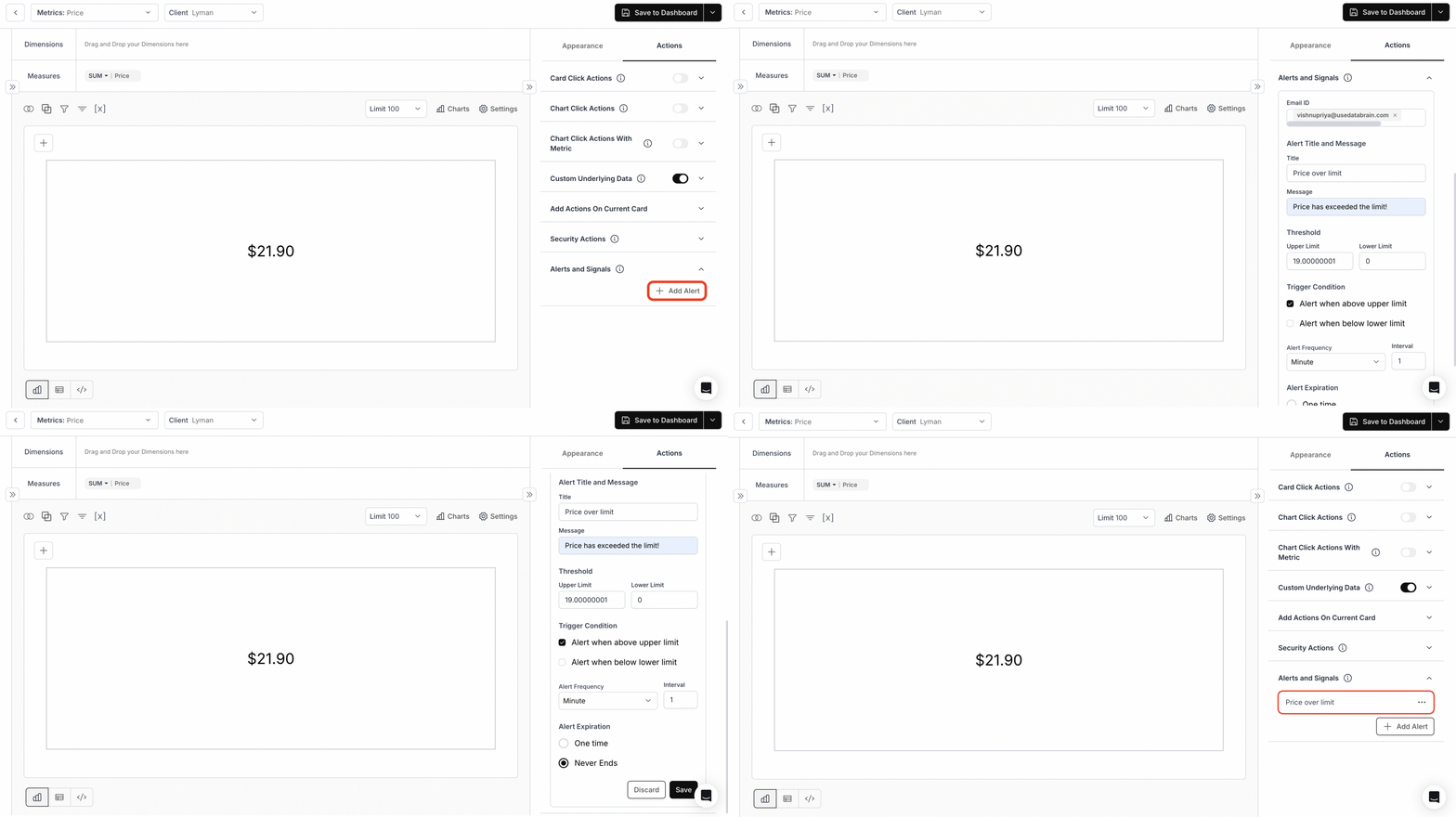
### 11. **Alerts & Signals**
For Single Value Cards, you can configure and set alerts to trigger notifications when data exceeds or falls below a specified threshold.
These options may vary depending on the **"Chart Type"** chosen. Some options may not be available for certain chart types.
**By tailoring these chart actions, you can ensure a customized and secure data visualization experience in Databrain.**
### 11. **Alerts & Signals**
For Single Value Cards, you can configure and set alerts to trigger notifications when data exceeds or falls below a specified threshold.
 You’ve successfully explored all major Chart Actions!\
Your dashboards can now deliver richer interactivity, smarter navigation, better forecasting, and secure data handling for every user.
You’ve successfully explored all major Chart Actions!\
Your dashboards can now deliver richer interactivity, smarter navigation, better forecasting, and secure data handling for every user.