> ## Documentation Index
> Fetch the complete documentation index at: https://docs.usedatabrain.com/llms.txt
> Use this file to discover all available pages before exploring further.
# Chart Appearance
> Personalize your metric charts with an array of appearance settings for clarity and visual appeal.
In Databrain, charts are highly customizable and extensible - you can control the appearance, format the labels, manage click behavior and drilldowns, and much more. This guide walks you through the key customization options to help you create professional and effective data visualizations.
## Access Chart Appearance
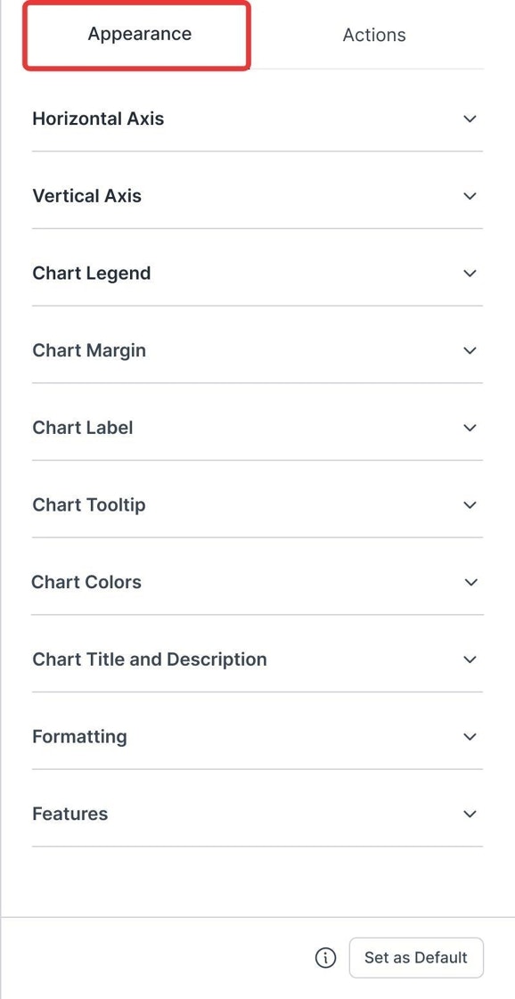
* Navigate to your metric card, click the **"Appearance & Actions"** icon, and select the **"Appearance"** tab.
 ### 1. Horizontal Axis Customizations
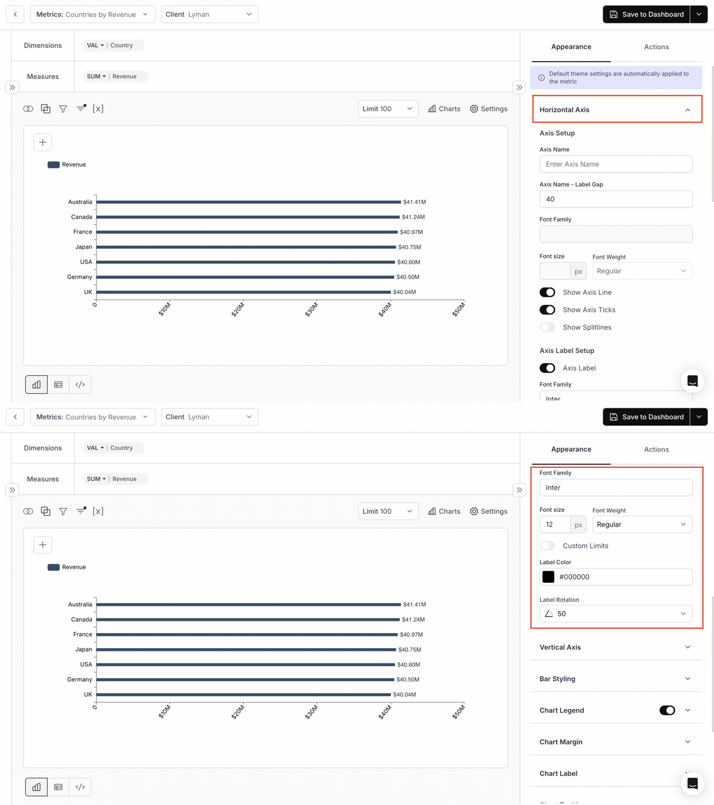
* **Toggles**: Axis Line, Splitlines, Axis Labels, Truncate Label.
* **Set Values**: Label Rotation, Custom Rotation, Truncate Label Value, Distance between name and labels.
* **Adjust**: Font properties and color.
**X-axis tick spacing is not configurable.** The horizontal-axis options control label appearance (rotation, fonts, visibility) — there is no setting for the numeric interval between ticks (e.g. "every 10 units"). If you need evenly spaced buckets, pre-bucket the data in SQL and use the bucket column as your x-axis, for example: `SELECT FLOOR(value/10)*10 AS bucket, COUNT(*) FROM t GROUP BY 1`.
### 1. Horizontal Axis Customizations
* **Toggles**: Axis Line, Splitlines, Axis Labels, Truncate Label.
* **Set Values**: Label Rotation, Custom Rotation, Truncate Label Value, Distance between name and labels.
* **Adjust**: Font properties and color.
**X-axis tick spacing is not configurable.** The horizontal-axis options control label appearance (rotation, fonts, visibility) — there is no setting for the numeric interval between ticks (e.g. "every 10 units"). If you need evenly spaced buckets, pre-bucket the data in SQL and use the bucket column as your x-axis, for example: `SELECT FLOOR(value/10)*10 AS bucket, COUNT(*) FROM t GROUP BY 1`.
 ### 2. Vertical Axis Customizations
* **Toggles**: Axis Line, Splitlines, Axis Labels.
* **Set Values**: Distance between name and labels.
* **Adjust**: Axis Position and font properties.
### 2. Vertical Axis Customizations
* **Toggles**: Axis Line, Splitlines, Axis Labels.
* **Set Values**: Distance between name and labels.
* **Adjust**: Axis Position and font properties.
 ### 3. Chart Legend
**Customize**: Display, appearance, position, truncation, and shape.
**Use Case**:
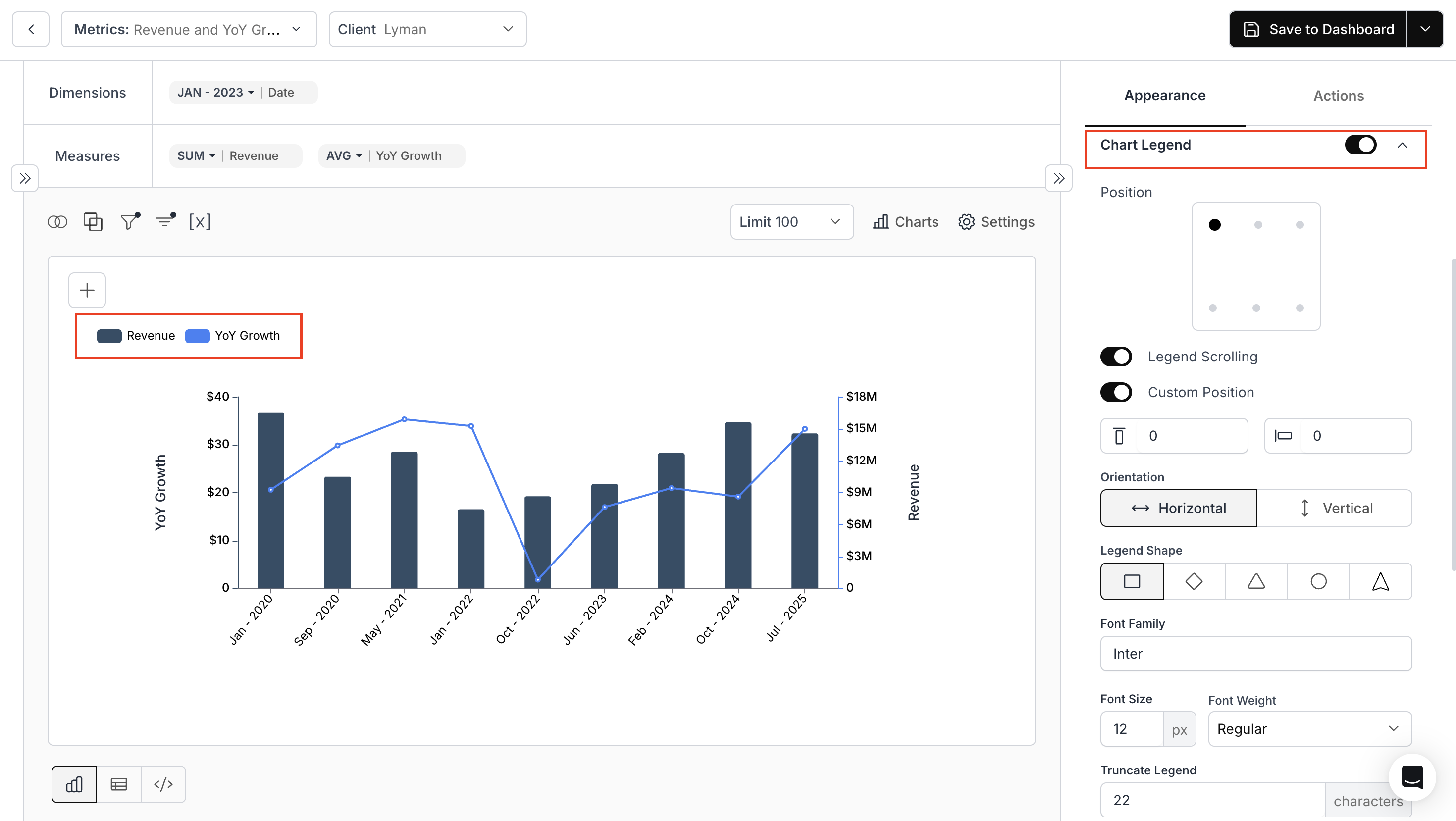
Let us take a combo multi-scales chart showing Revenue (purple bars) and YoY Growth (blue line).\
When you customize the Chart Legend, you can configure:
* **Position**: Top-left, center, right; Middle-left, center, right; Bottom-left, center, right
* **Orientation**: Horizontal (side by side) or Vertical (stacked)
* **Legend Shape**: Square, Diamond, Triangle, Circle, Line
* **Set**: the Font, Font size, and Label Color and also truncate the size of label
The legend now appears exactly how and where you want it, making the chart clearer and more professional.
### 3. Chart Legend
**Customize**: Display, appearance, position, truncation, and shape.
**Use Case**:
Let us take a combo multi-scales chart showing Revenue (purple bars) and YoY Growth (blue line).\
When you customize the Chart Legend, you can configure:
* **Position**: Top-left, center, right; Middle-left, center, right; Bottom-left, center, right
* **Orientation**: Horizontal (side by side) or Vertical (stacked)
* **Legend Shape**: Square, Diamond, Triangle, Circle, Line
* **Set**: the Font, Font size, and Label Color and also truncate the size of label
The legend now appears exactly how and where you want it, making the chart clearer and more professional.
 ### 4. Chart Margin
Define margins for all four sides of the chart.
### 4. Chart Margin
Define margins for all four sides of the chart.
 ### 5. Chart Label
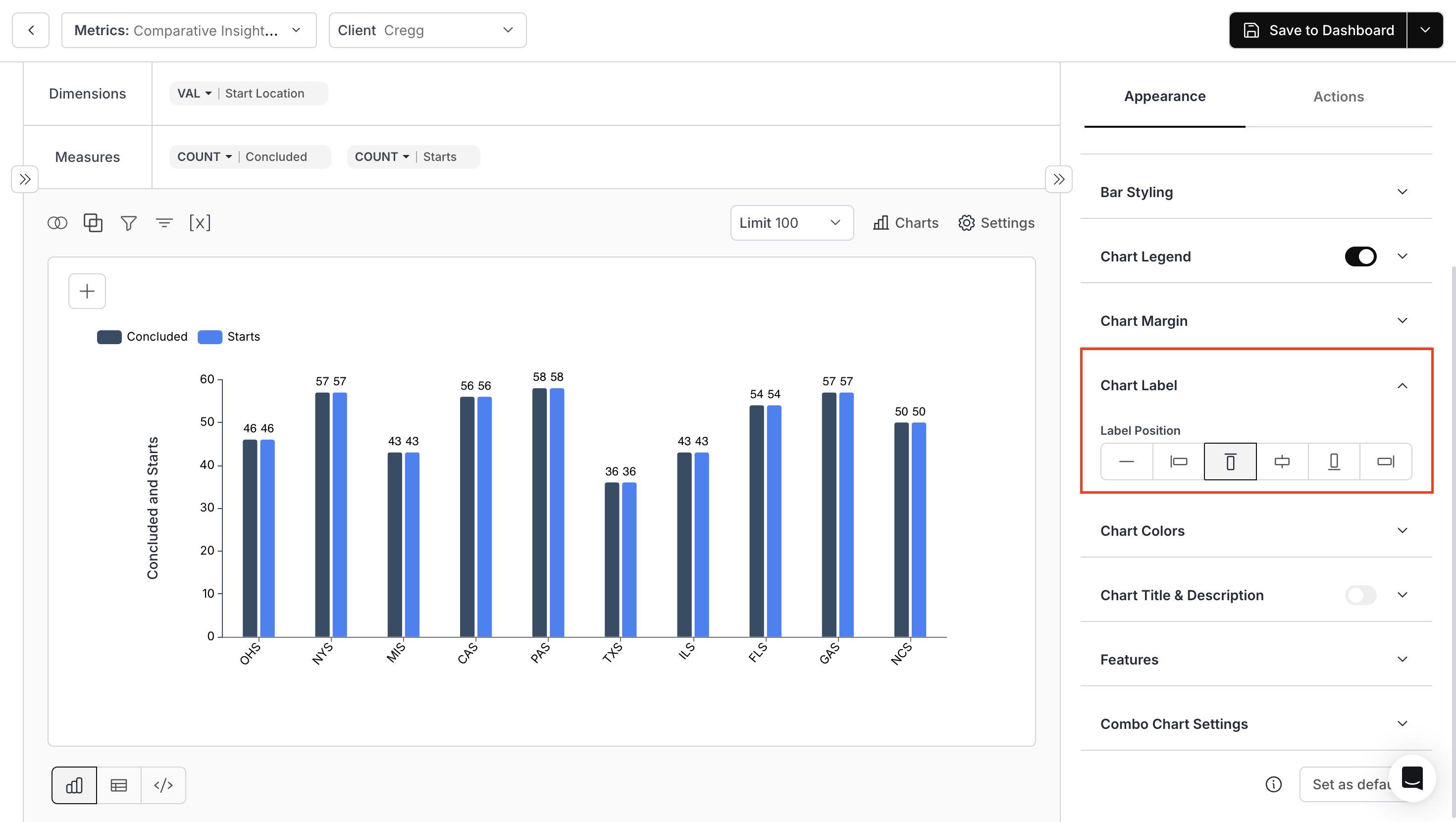
**Position:** Determine where value labels appear on the chart.
**Use Case:**\
Consider a comparative bar chart displaying Concluded and Starts counts across various locations. With the Chart Label setting, you can choose exactly where the value labels appear—inside the bar, above it, centered, or aligned left or right.
### 5. Chart Label
**Position:** Determine where value labels appear on the chart.
**Use Case:**\
Consider a comparative bar chart displaying Concluded and Starts counts across various locations. With the Chart Label setting, you can choose exactly where the value labels appear—inside the bar, above it, centered, or aligned left or right.
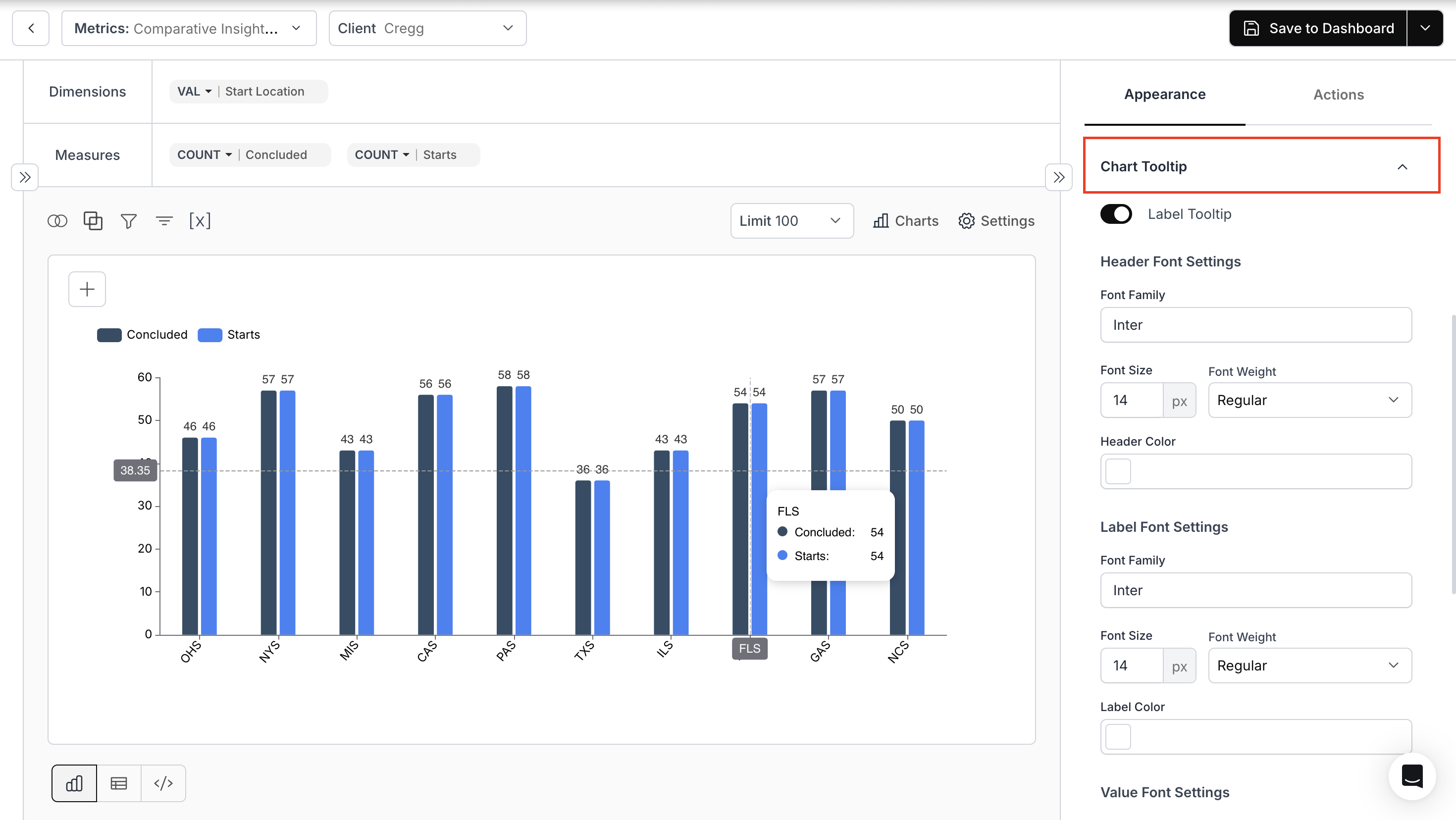
 ### 6. Chart Tooltip
**Adjust:** Font and color for Header, Label, and Value.
**Use Case:**\
When you hover over any bar, the Chart Tooltip provides detailed information. You can further customize tooltip fonts and colors.
### 6. Chart Tooltip
**Adjust:** Font and color for Header, Label, and Value.
**Use Case:**\
When you hover over any bar, the Chart Tooltip provides detailed information. You can further customize tooltip fonts and colors.
 ### 7. **Chart Colors**
**Modify:** Chart colors, gradients, and background gradients.
### 7. **Chart Colors**
**Modify:** Chart colors, gradients, and background gradients.
 ### 8. Chart Title & Description
**Add:** Titles and descriptions, and adjust their positions.
### 8. Chart Title & Description
**Add:** Titles and descriptions, and adjust their positions.
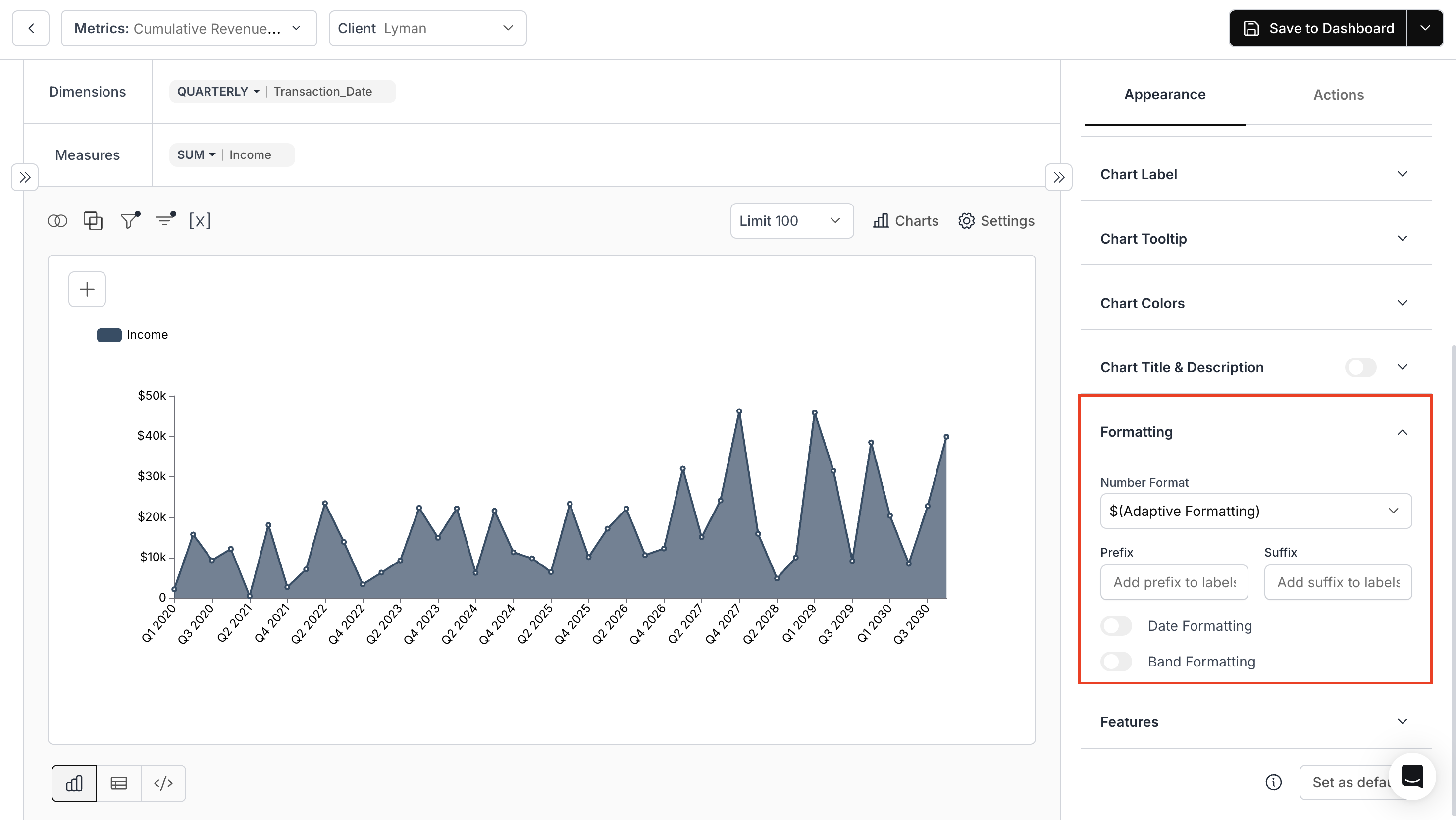
 ### 9. Formatting
**Set:** Number formatting, and prefix or suffix.
### 9. Formatting
**Set:** Number formatting, and prefix or suffix.
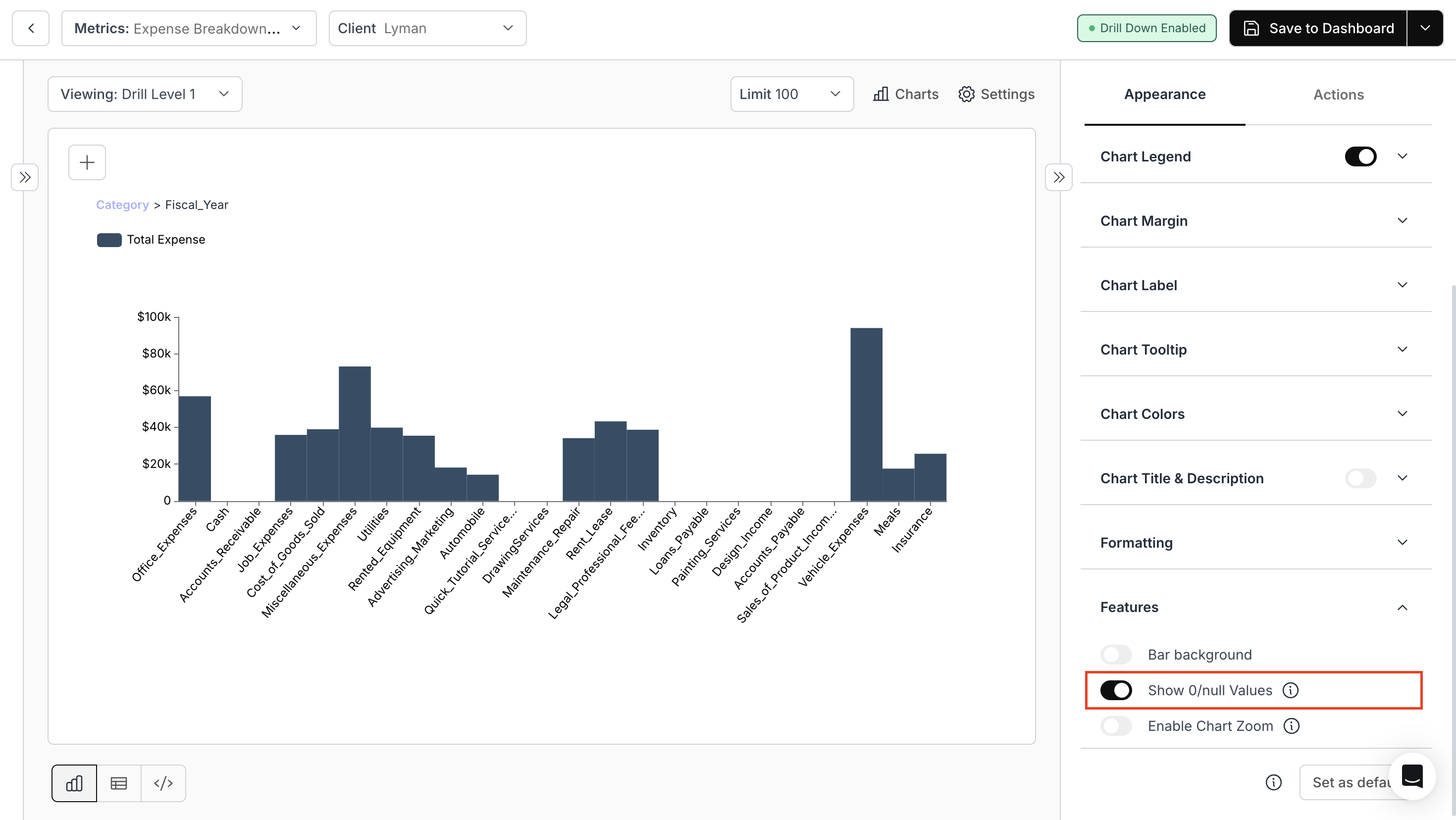
 ### 10. Features
Options vary based on chart type.
### 10. Features
Options vary based on chart type.

 Specific chart types offer unique customizations.
> **Note:** Options may vary based on the **"Chart Type"** chosen.
For chart-specific appearance options, refer to the link below:
Explore appearance settings unique to each chart type such as bar, line, area, and combo charts.
You’ve successfully configured chart appearance.\
Your visualizations now follow a consistent, professional style with clearer labels, cleaner legends, and improved readability.
Specific chart types offer unique customizations.
> **Note:** Options may vary based on the **"Chart Type"** chosen.
For chart-specific appearance options, refer to the link below:
Explore appearance settings unique to each chart type such as bar, line, area, and combo charts.
You’ve successfully configured chart appearance.\
Your visualizations now follow a consistent, professional style with clearer labels, cleaner legends, and improved readability.