

- Access UI Theming:
- Click on the “Settings” tab near the Data Studio tab.
- In the “Embed Settings” section, select “UI Theming” from the settings menu tabs and click on ”+ Add New Theme”.
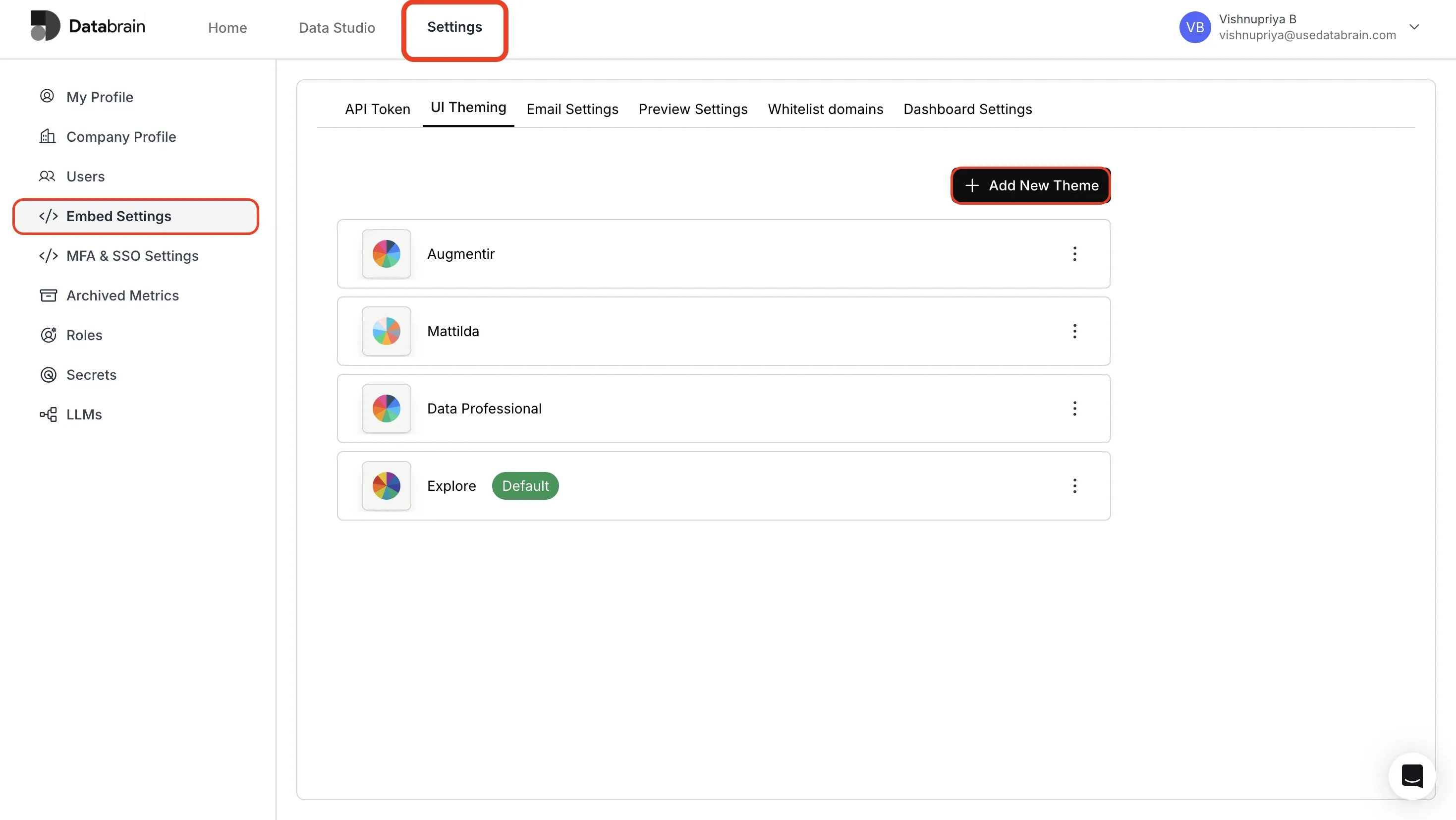
- Configure Basic Theme & Dashboard Settings:
- Enter Theme Name in text field and set a suitable Font Family.
- Choose your desired dashboard and metric background colors.
- Use the Disable Dashboard Minimap toggle to hide the dashboard minimap and progress header in the app. The minimap is enabled by default in the app.
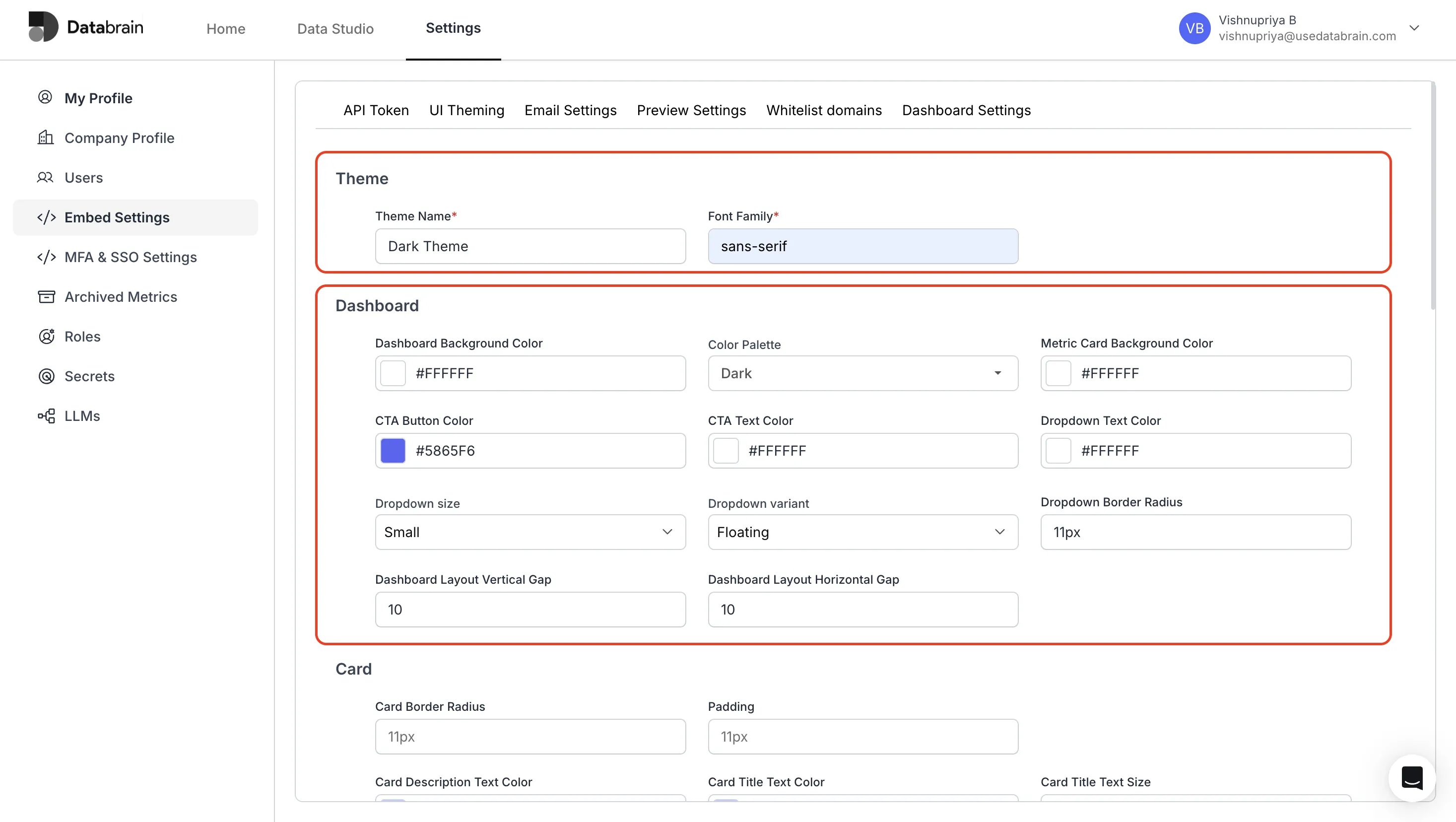
- Configure Card Settings:
- Enter card border, card description and card title details.
- Choose relevant colors for the card title and card description.
The metric card title supports a text color (“Card Title Text Color”) but not its own background color. To change the color behind the title, use “Metric Card Background Color” — it applies to the whole card, title included. There is no separate title-background setting; pairing a contrasting card background with a title text color is the supported way to make the title stand out.
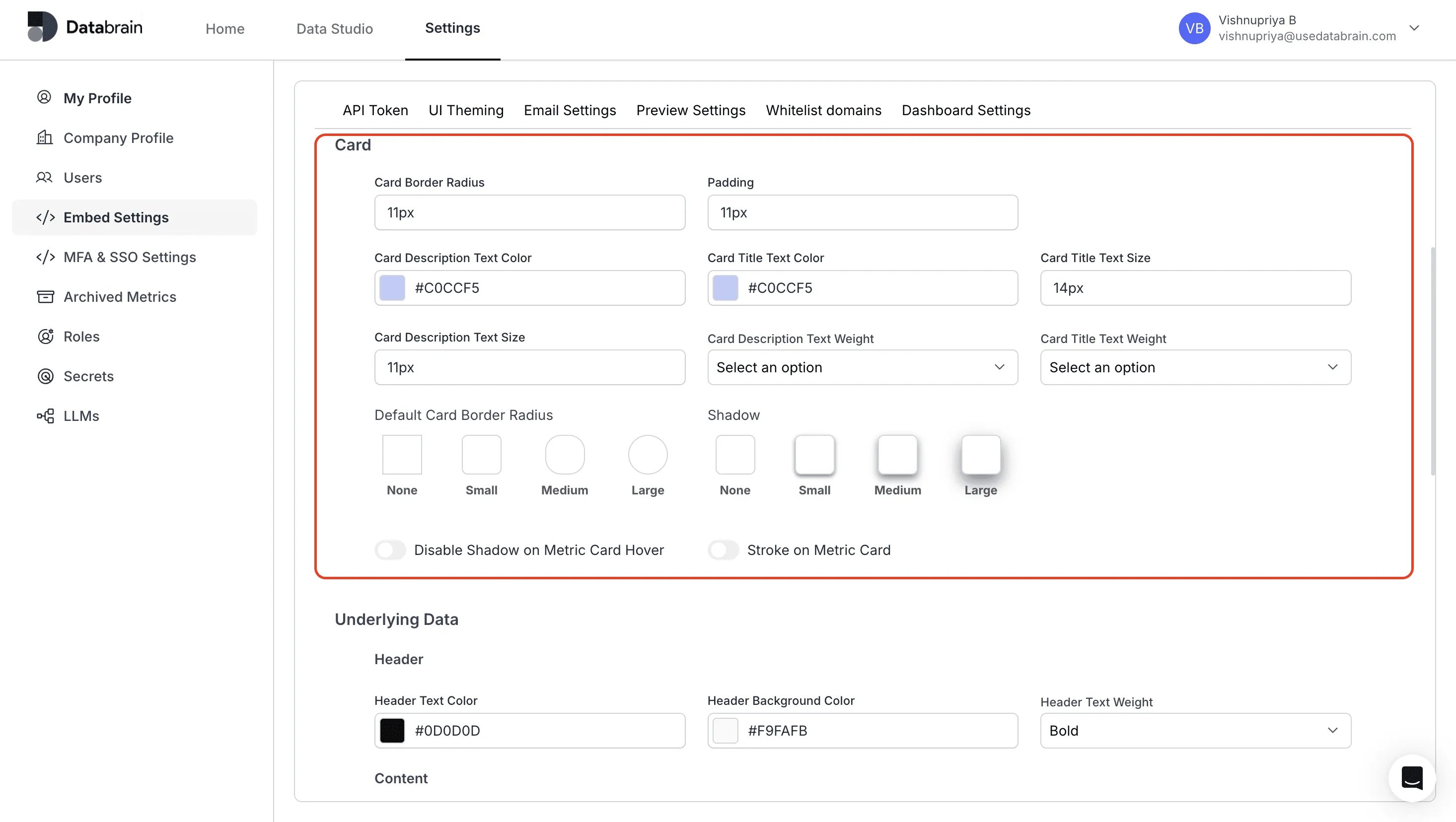
- Configure Underlying Data Settings :
- Choose the Color options for the header and content.
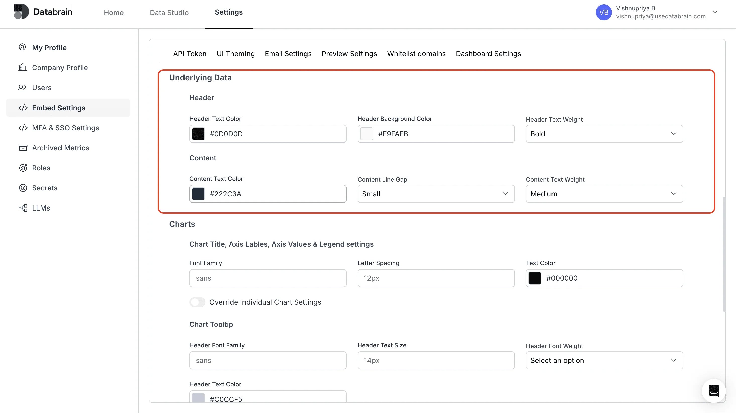
- Configure Chart Settings :
- Enter the Font family and choose the color for the Chart title.
- Choose the Font and colour options for Chart tooltip.
Chart palettes and why palette selection can appear greyed out. The theme’s chart config defines the available palettes (
chart.palettes, each { name, colors }), which of them are selectable in chart settings (chart.paletteOptions, a list of palette names), and the default (chart.selected). If paletteOptions is empty or lists none of the defined palettes, the palette picker in chart settings shows “Palette Options not yet configured” and cannot be changed — the dashboard-level theme is the source of truth. To unlock palette selection, add the palette names you want selectable to paletteOptions. In embedded dashboards the same can be supplied via the chartPaletteOptions and chartColors component options.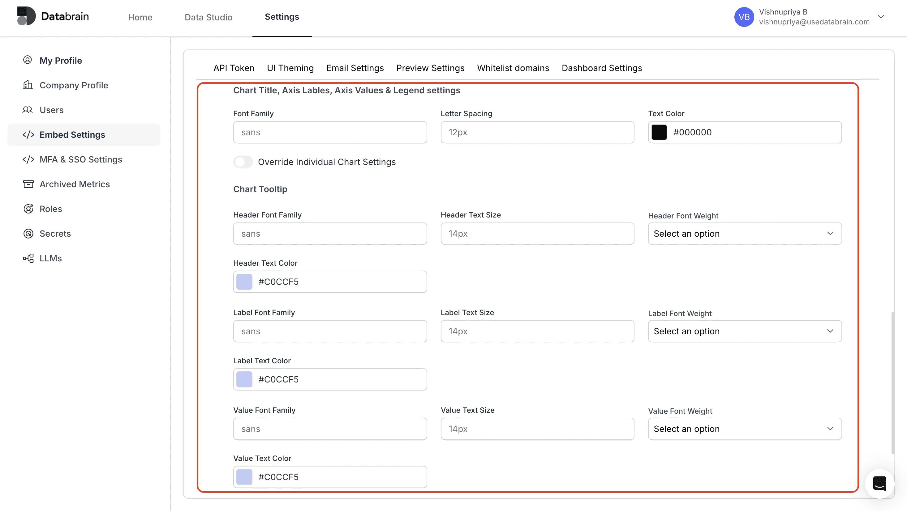
- Configure Date Picker :
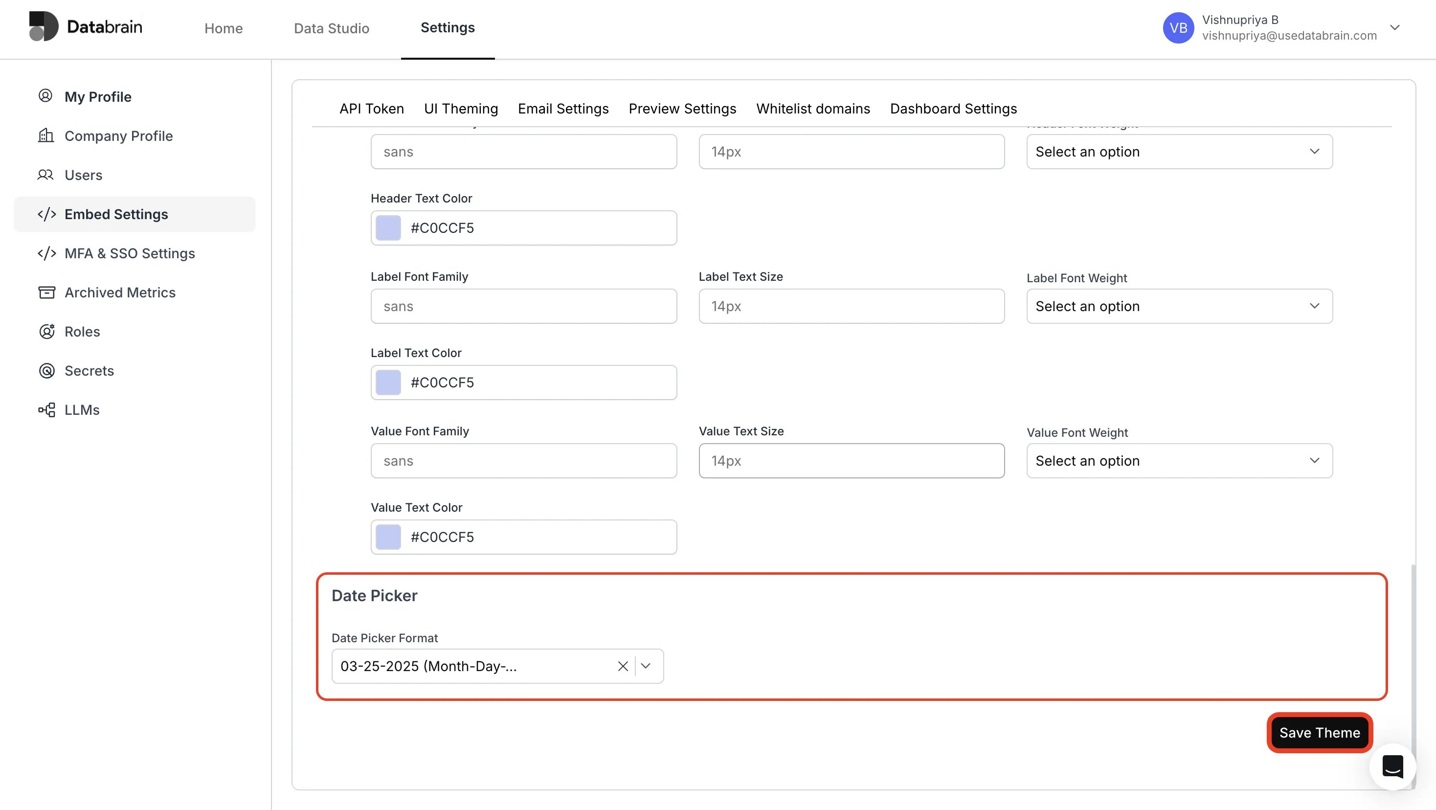
- Choose the Date Picker Format from the dropdown options (e.g.
MM/DD/YYYY,DD-MM-YYYY,Mon DD, YYYY). This controls how dates display in date pickers across the dashboard. In embed code, the same setting is the theme config keygeneral.datePickerFormat. - Finally, click “Save Theme” to save your created theme.
- View your created theme in the UI Theming page
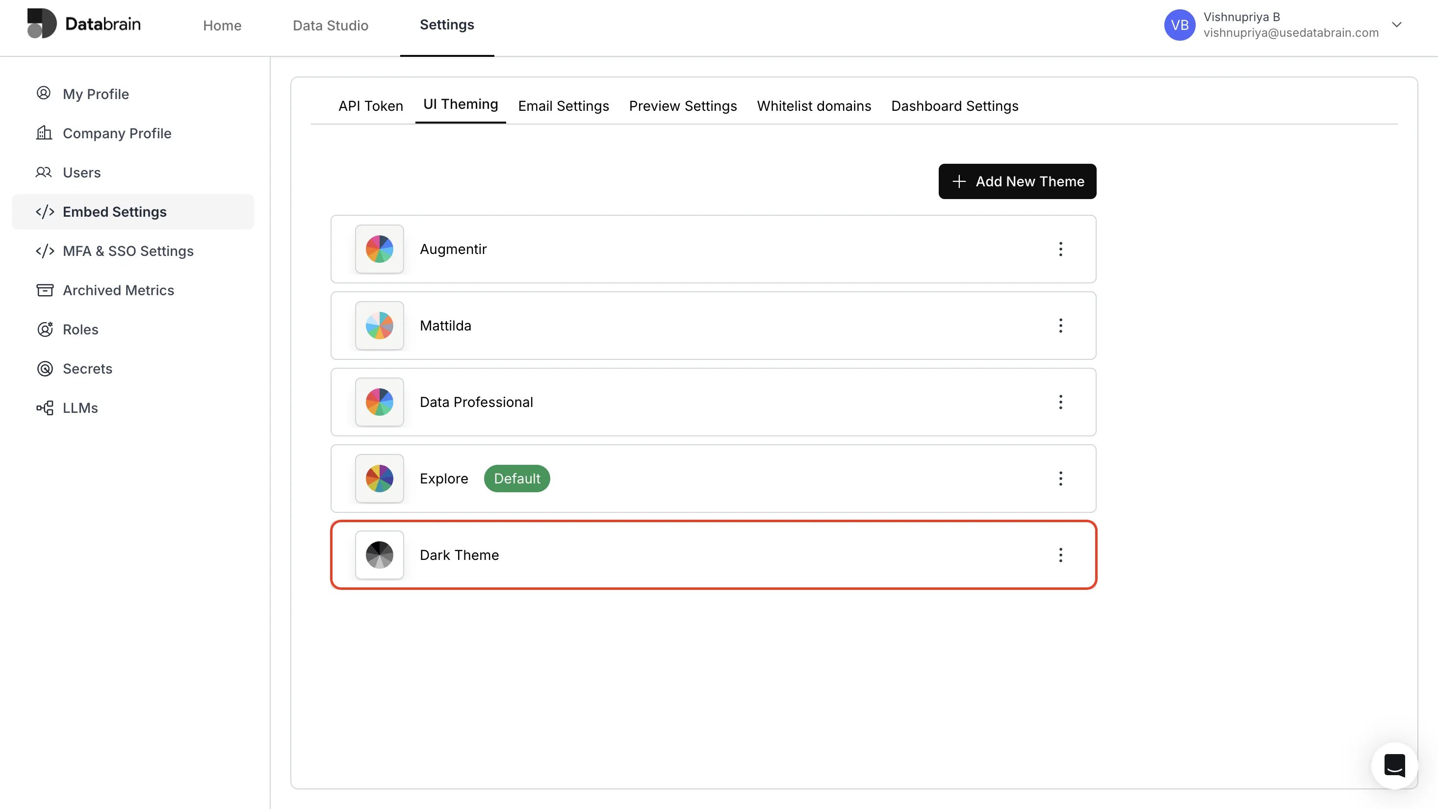
You have succesfully created your Dashboard theme in Databrain !