1. Bar Chart Styling
Applies to: Bar Charts, Stacked Bar Charts, Combo Charts (Single-Scale), Horizontal Bar Charts, Horizontal Combo Charts, and Horizontal Stacked Bar Charts• Purpose and Use Case
Bar charts are ideal for comparing discrete categories, with vertical bars enabling clear magnitude comparisons across business units.• Key Style Parameters
- Width: Controls spacing between bars to optimize data visibility and category comparison
- Top Radius: Adds modern, soft edges for professional presentation
- Bottom Radius: Provides visual stability while harmonizing with top radius

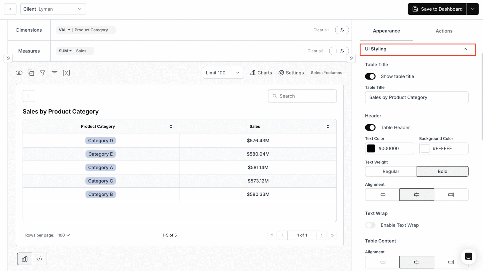
2. Table Chart UI Styling
• Essential Design Elements
- Headers: Clean black text on white background
- Category Display: Categories presented as visual badges
- Number Formatting: Right-aligned sales figures
- Interactive Features: Medium spacing with responsive hover effects
• Business Benefits
- Facilitates quick executive review
- Enables efficient sales comparisons
- Maintains professional appearance
- Provides immediate access to insights
3. Circular Chart Customization
Applies to Pie Charts and Rose ChartsChart 1: Pie Chart Options
Interaction Modes:
- Single: Expands one sector at a time on click
- Multiple: Expands multiple sectors sequentially
- Series: Expands all sectors together
- Offset: Adjusts expansion distance in pixels
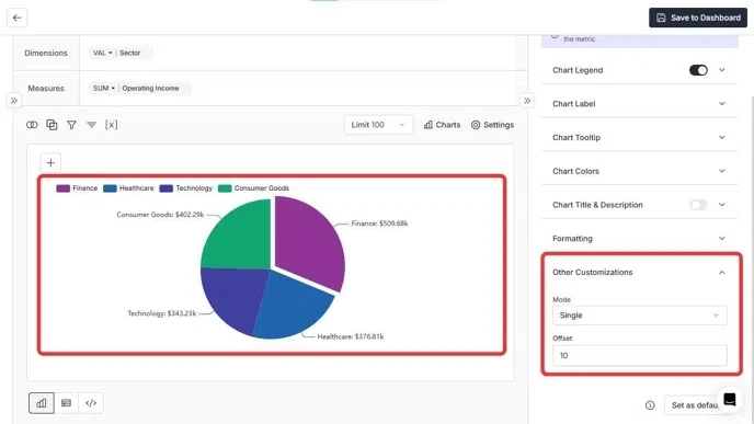
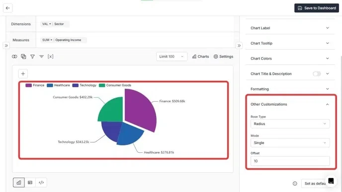
Chart 2: Rose Chart Options
Chart Types:
-
Radius Mode
▪ Highlights absolute value differences
▪ Ideal for category magnitude comparison -
Area Mode
▪ Displays proportional relationships
▪ Useful for market share analysis
Interaction Settings:
- Supports Single, Multiple, and Series modes
- Adjustable offset distance
You’ve successfully reviewed chart-specific appearance options.
Your visualizations now follow consistent styling across bar charts, tables, and circular charts for clearer, more professional insights.
Your visualizations now follow consistent styling across bar charts, tables, and circular charts for clearer, more professional insights.